Medimatch
Streamlining healthcare access by designing an AI-powered mobile app that intelligently matches patients to providers.
Role
UX/UI Designer
Industry
Health
Year
2025

Overview
Background
In the US, patients report difficulty finding and booking appointments with appropriate specialists, often waiting weeks for care while navigating a fragmented healthcare system. Existing healthcare booking platforms require users to have an understanding of medical diagnoses, insurance networks, and provider specialties which creates barriers before care even begins.
Problem
Patients struggle to answer a fundamental question: "Which doctor should I see, and when can I see them?" Current booking experiences assume users already know what type of provider they need, forcing them through time-consuming searches across multiple platforms, phone calls, and insurance verification, which leads to abandoned bookings or delayed care.
Solution
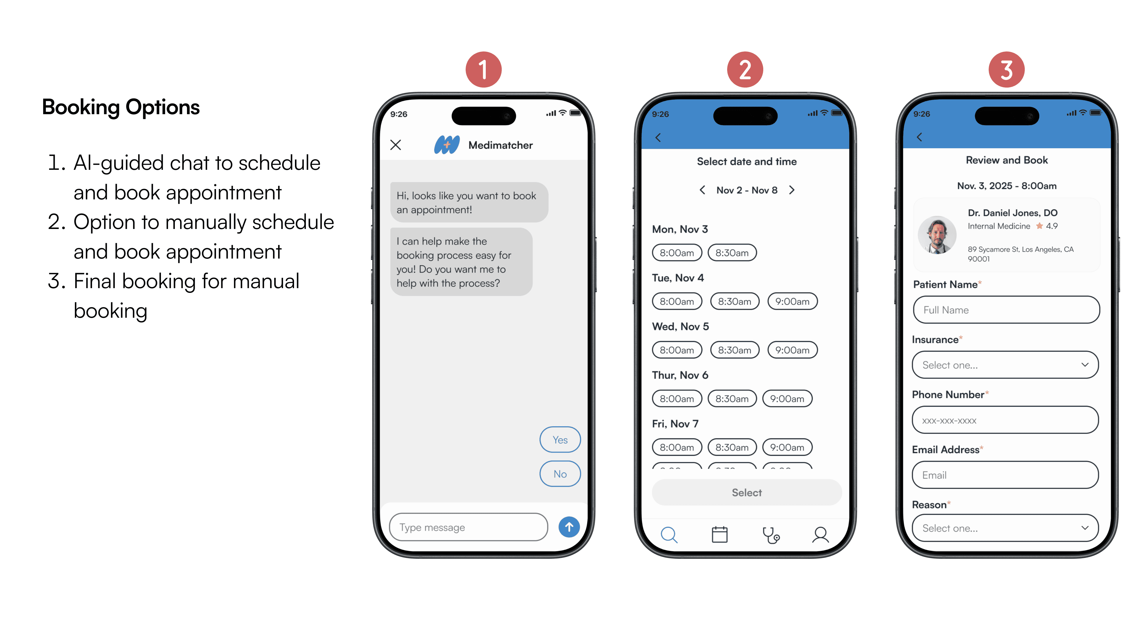
A healthcare booking app that guides patients from symptoms to scheduled appointments. Using conversational AI, the app translates user concerns into appropriate provider matches, checks real-time availability across insurance networks, and confirms bookings while still giving users full transparency and control to adjust recommendations at any step.

The Process
Competitive Analysis
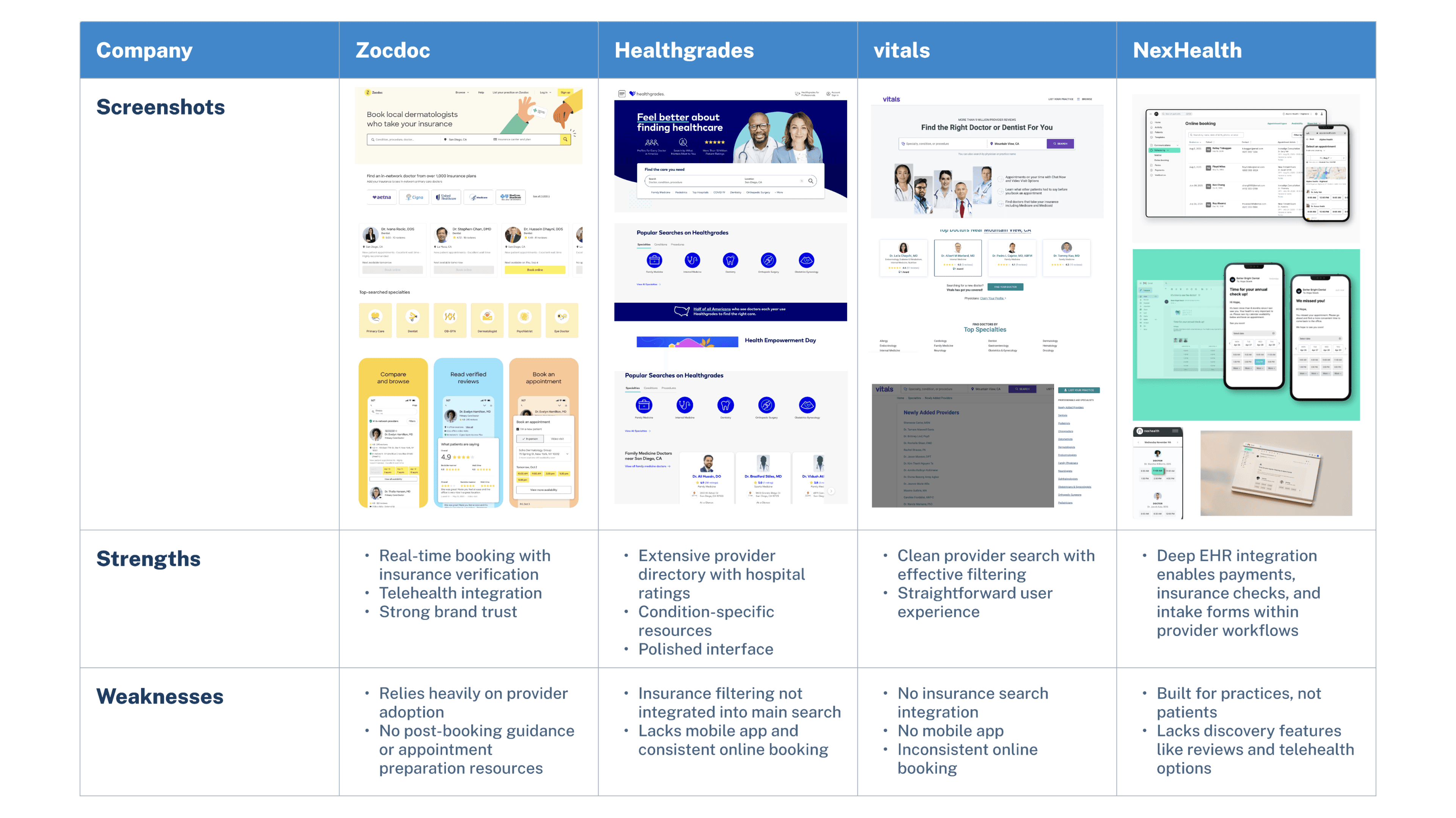
Current healthcare booking platforms list providers, but nobody provides personalized matches.
My analysis revealed that platforms like Zocdoc and Healthgrades handle logistics like real-time booking and insurance filtering well, but assume patients already know which provider to see. Instead of personalized guidance, patients get lists of hundreds of providers with no indication of which one is right for them. No symptom-based filtering, no personalized ranking, no cost transparency, no appointment preparation. The burden of that decision falls entirely on the user.
User Research
Patients need faster booking and trusted guidance.
I interviewed patients who had recently booked medical appointments to pinpoint where users get stuck and why current solutions fall short. These interviews uncovered a need for trusted guidance throughout the care journey, from symptom interpretation to provider selection to appointment confirmation.
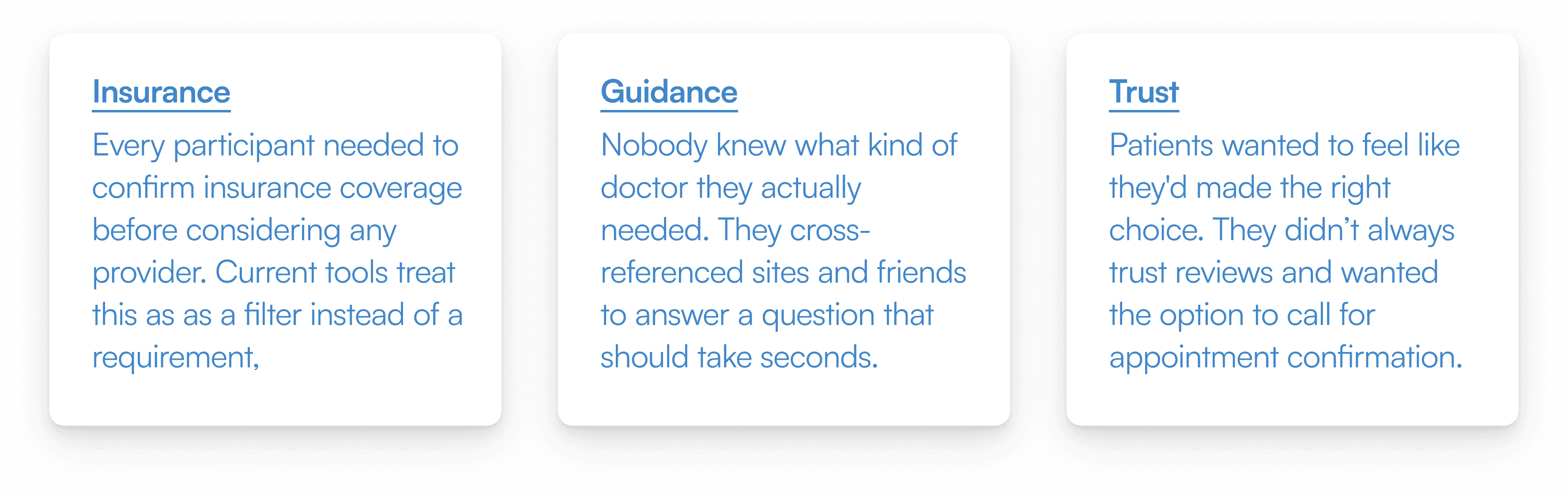
Key Insights
Insurance is the first and biggest barrier. Every participant prioritized confirming in-network coverage before considering any provider, but current tools still cause difficulty.
Patients don't know which doctor to see. Once insurance was verified, users struggled to match symptoms to the right provider type. Reviews helped but weren't trusted without cross-referencing multiple sources.
Online booking feels unreliable. Outdated listings, duplicate forms, and integration issues led patients to call offices for confirmation—undermining the convenience of digital booking.
Appointment preparation is inadequate. Users felt unprepared about costs, what to bring, and what to expect, relying on handwritten notes to track symptoms and questions.
Trust requires human reassurance. Beyond credentials, patients valued empathy, clear communication, and personal confirmation that their appointment was real.
Personas
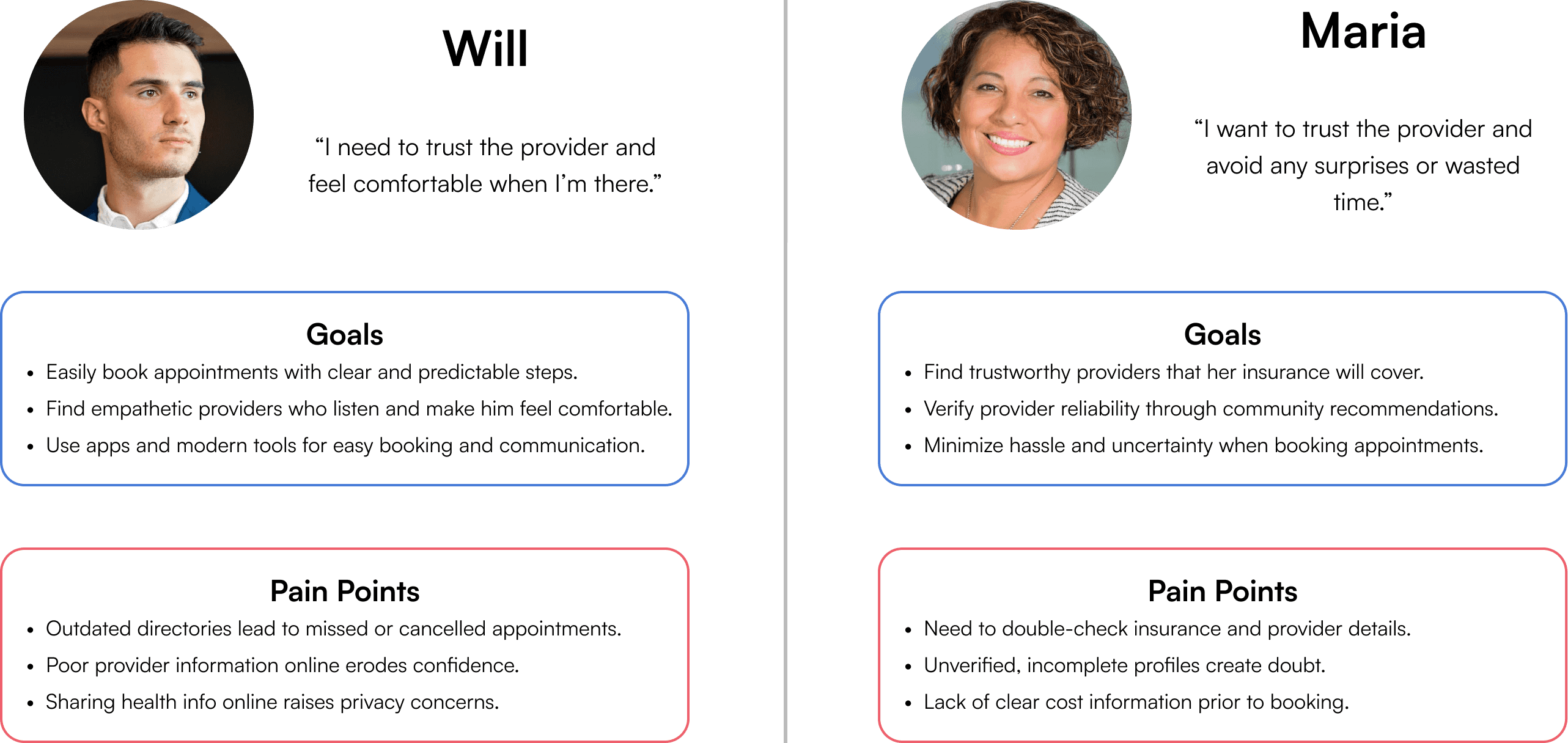
Two types of patients, one shared frustration: navigating a system that assumes too much.
Using insights gathered from the user interviews, I created user personas to reflect the personality types of the users and their pain points and goals. The two personas were grounded in their focus on trust, reliability, and ease when booking doctor appointments.
Problem Statements
Defining the problems with the healthcare booking journey.
Through my research I found that patients feel overwhelmed throughout the booking journey, from choosing providers with unreliable information to arriving at appointments unprepared and anxious about communicating symptoms. Using these findings I developed three 'how might we' questions to guide the design phase.

User Flow
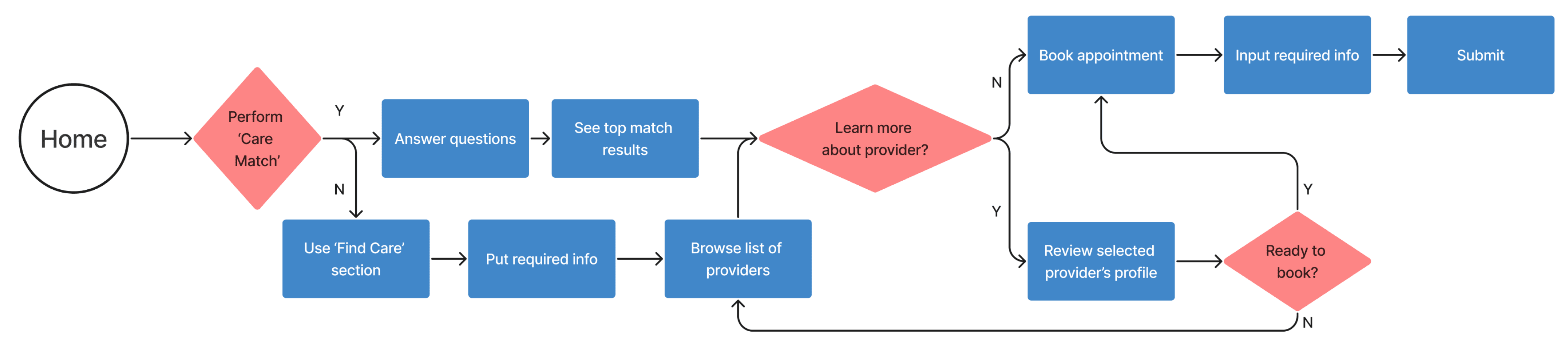
The AI-guided booking flow.
I created a user flow to illustrate how patients would be guided from initial symptom input through provider selection to appointment confirmation, reducing friction and building trust throughout the process.
Wireframes
Designing and testing the core experience.
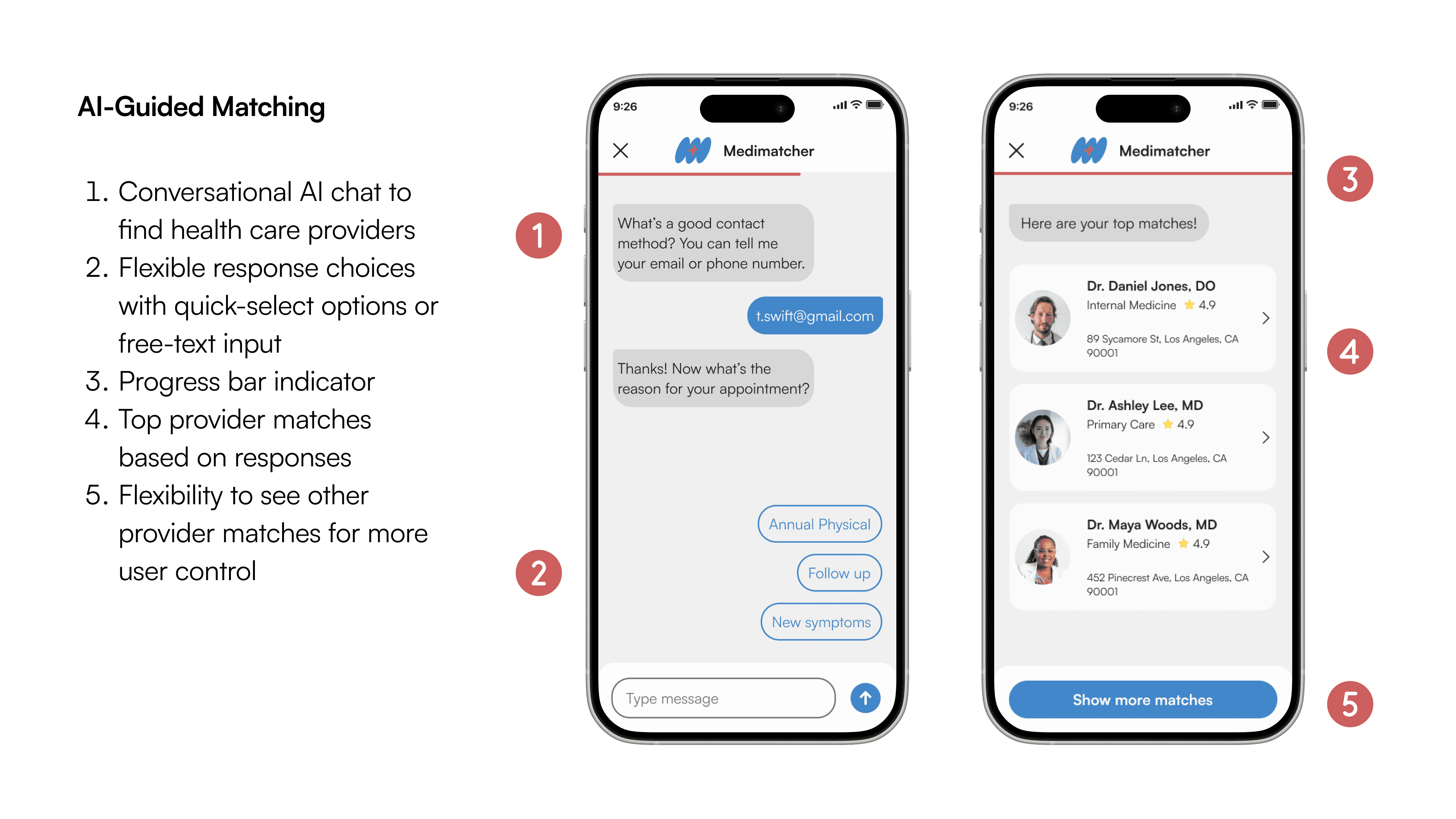
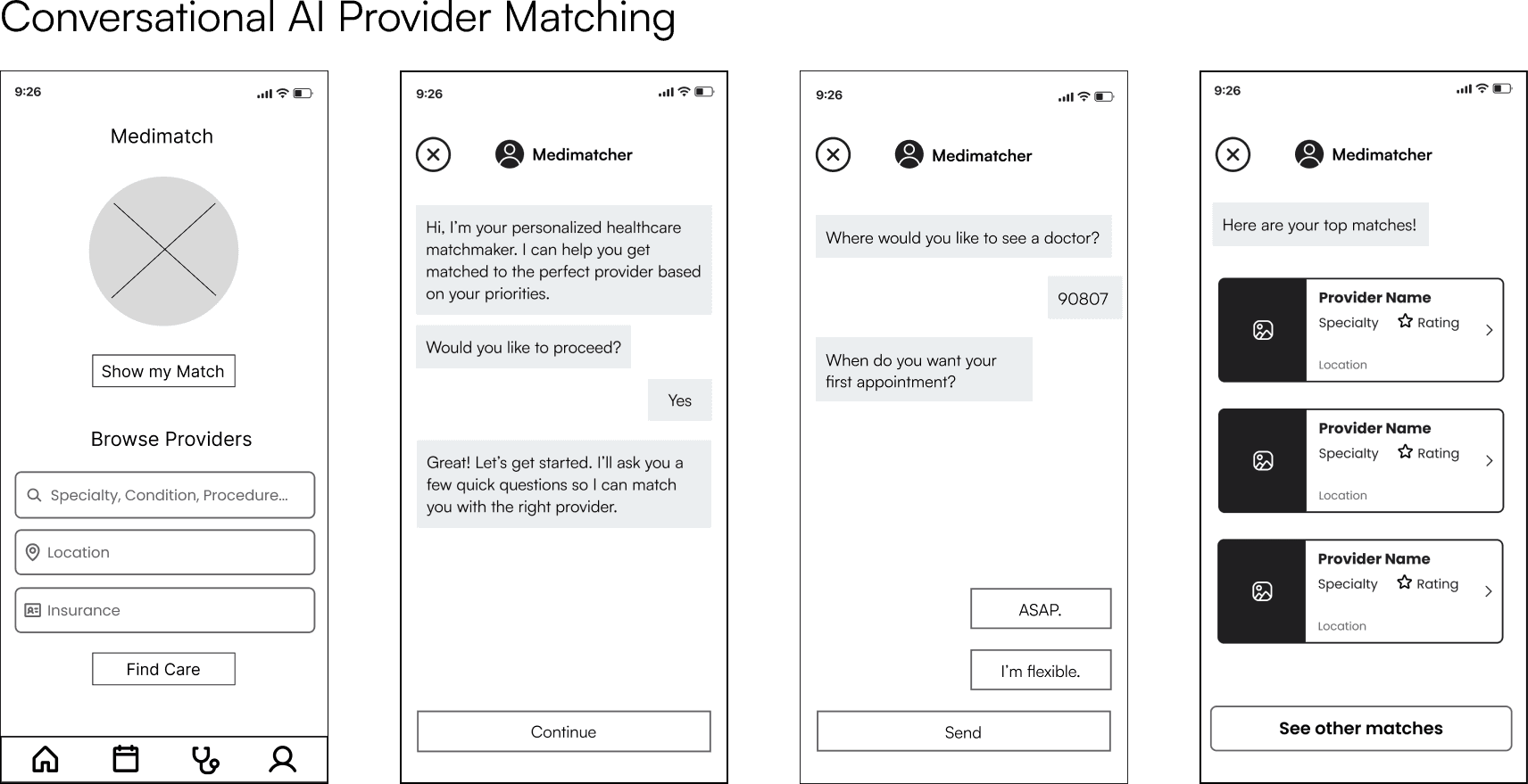
Starting with low-fidelity sketches, I explored key user flows focusing on the AI-guided provider matching and scheduling. These initial concepts were digitized into mid fidelity and tested to validate usability and interaction patterns.
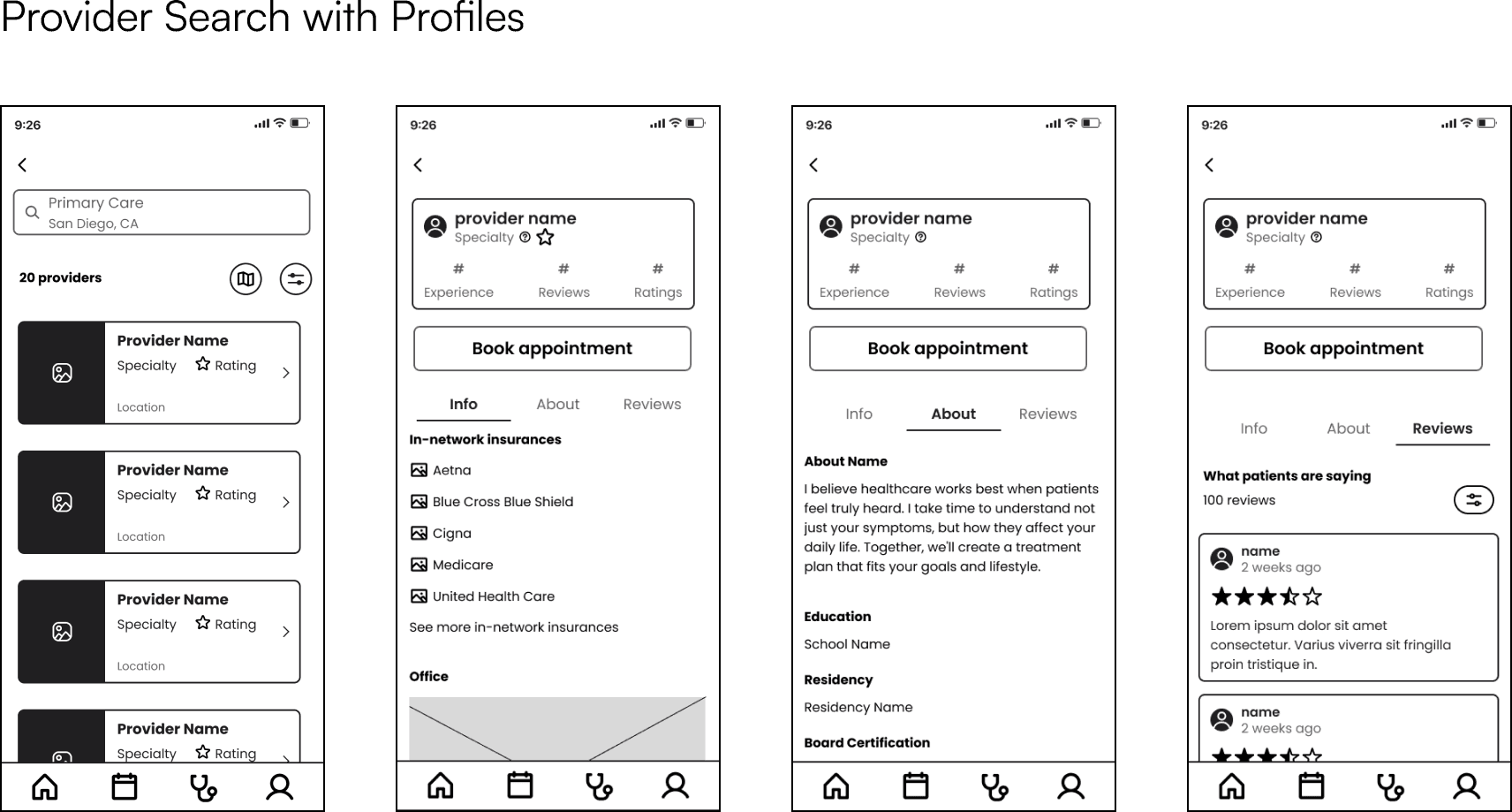
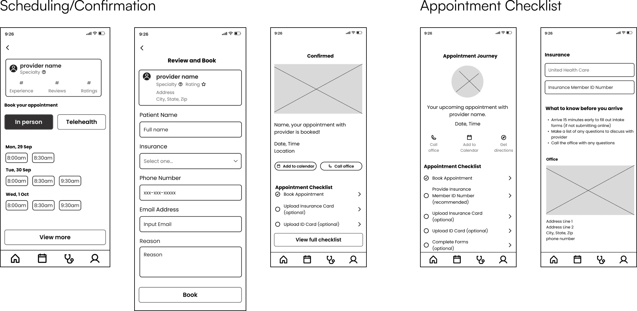
Usability Testing
Initial usability testing revealed opportunities to clarify terminology, reduce redundancy, and improve navigation discoverability.
Usability testing at each stage ensured the design remained user-centered while increasing visual polish. Informed by usability testing insights, I made iterations then added branding and visual polish to create high-fidelity wireframes.
What I found from low and mid fidelity testing:
'Care Match' feature landed, but the language didn't.
The personalization concept tested well, but terminology like "Show my match," "Find care" caused consistent hesitation. Two CTAs on one screen created decision paralysis, and users didn't always know which to select.The two booking paths confused each other.
Find Care tested well in isolation, but when both entry points appeared together the first screen felt overwhelming. The distinction needed to be explicit, not assumed.The chat flow had redundant steps.
Users had expressed frustration with having to click one of the pre-selected responses and then the 'send' button. This interaction had to be simple and quick to prevent drop out rates.
With the concept validated and the core flows restructured, high fidelity testing shifted focus to interaction quality and visual polish.
Final Designs
The final iteration incorporated testing insights to fine-tune interactions, visual hierarchy, and user flows.
Tasks completion during high fidelity testing remained strong with 100% completion rate. Most participants moved through booking, intake, and insurance upload with ease. But three recurring friction points surfaced that shaped the final design.
Top level design refinements:
Decreased amount of clicks in the chat interface, so selections now submit instantly.
Multiple participants flagged the same issue: selecting an option in the chat flow and then having to click "send" felt redundant. I removed the separate send step so selections submitted immediately, making the flow feel faster and more conversational.Added progress indicator to keep users oriented at every step.
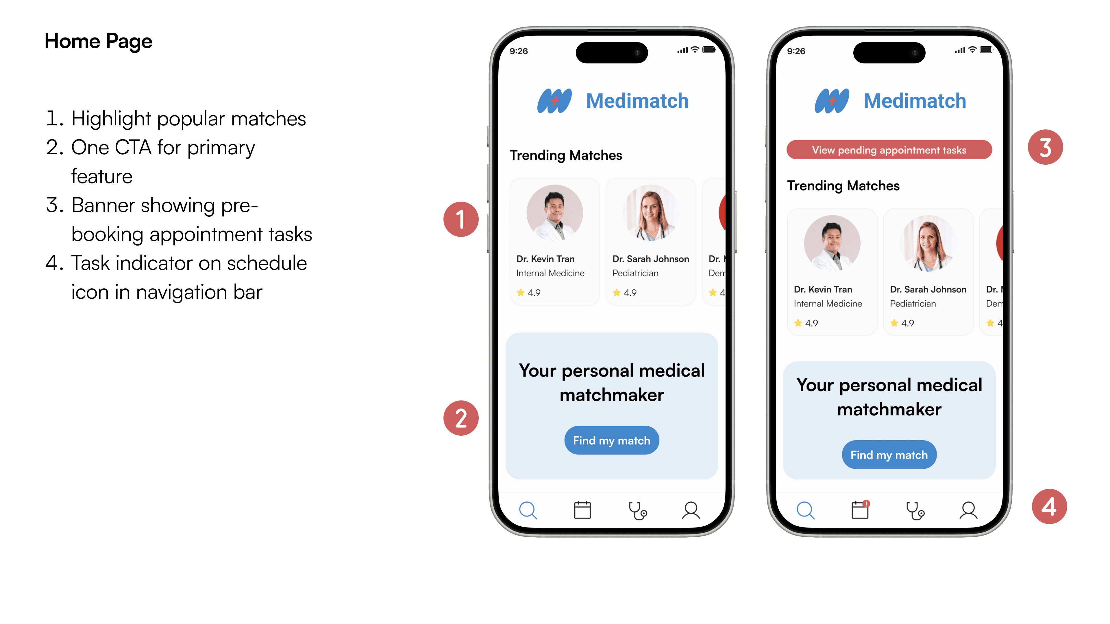
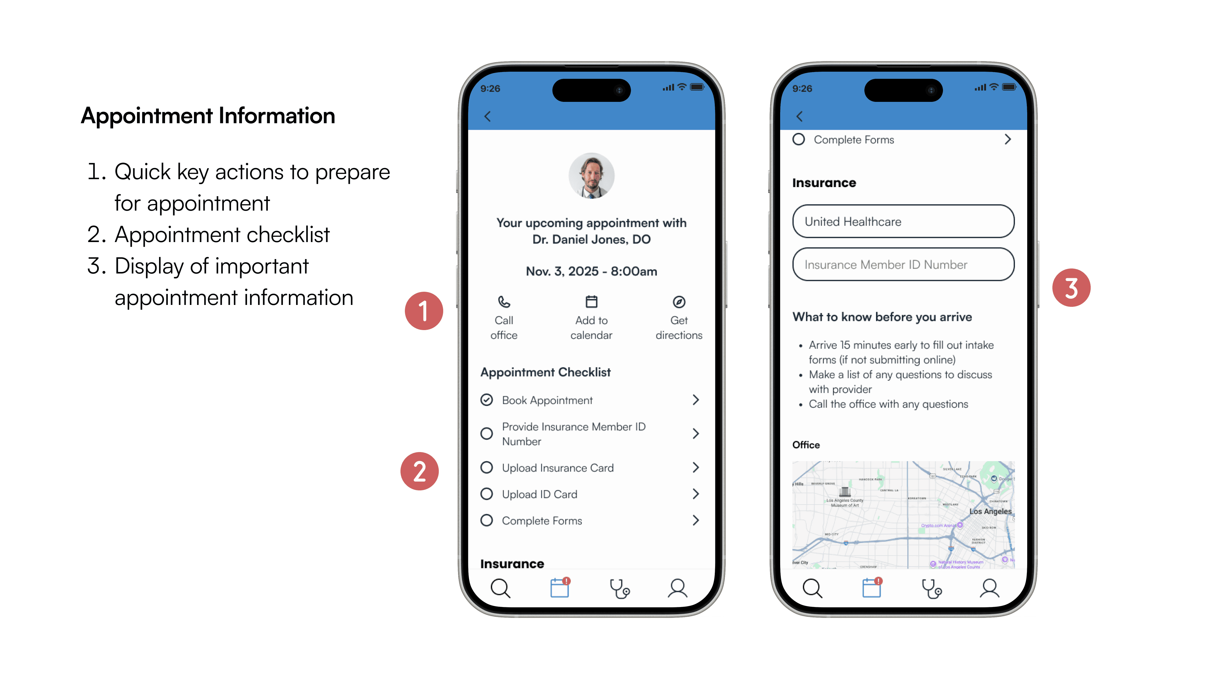
Without a progress indicator participants felt uncertain mid-flow, unsure of how many steps remained or whether they were close to being done. I added a progress indicator to the Care Match flow so users always knew where they stood.Post-booking tasks surface immediately on the main page and navigation bar.
Two participants struggled to locate the intake form after booking, and it wasn't visible enough from the main screen. I added home page alert and updated the scheduling icon in the navigation bar, surfacing post-booking tasks immediately after an appointment was confirmed, thus reducing the risk of users missing critical next steps.
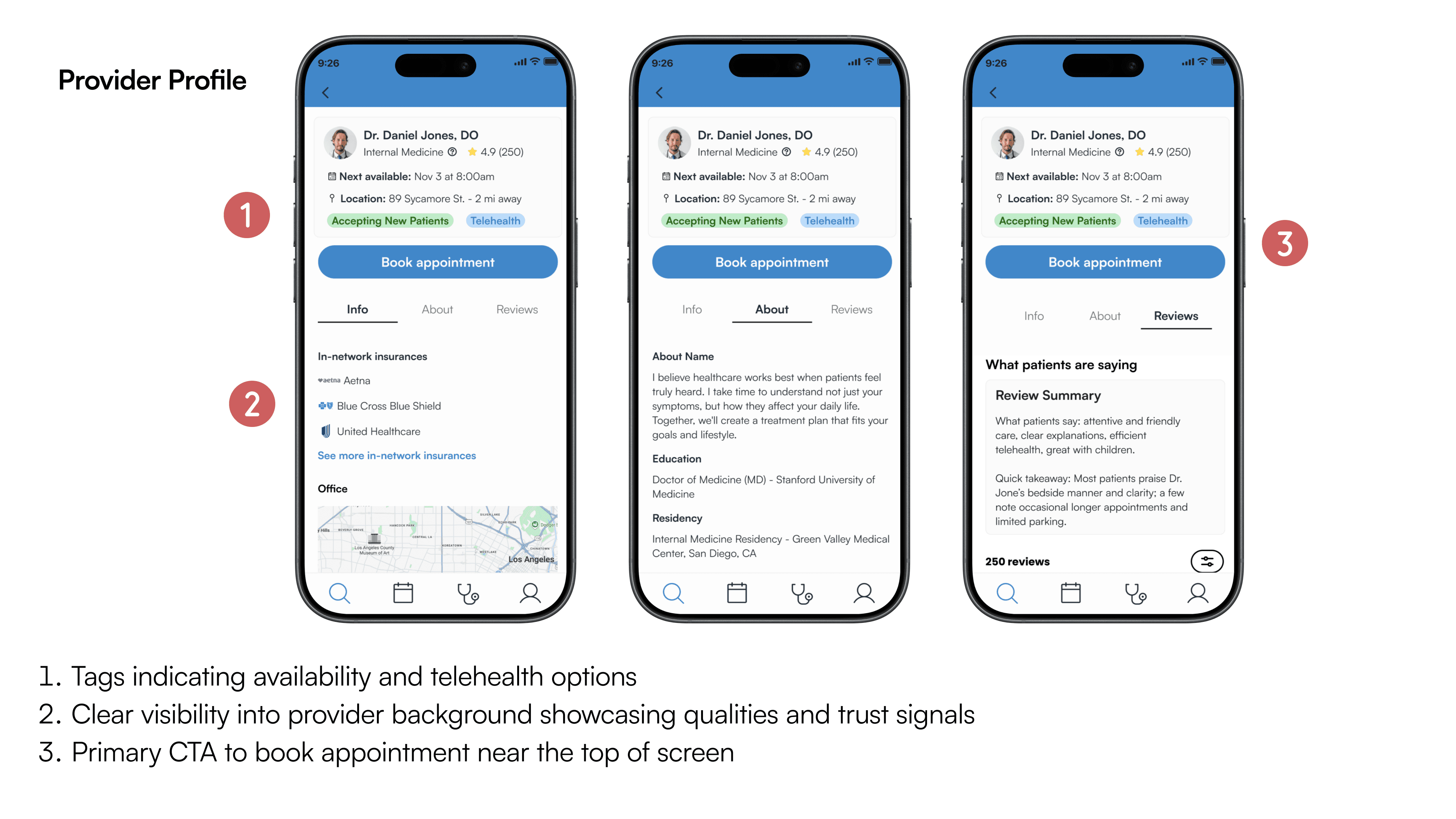
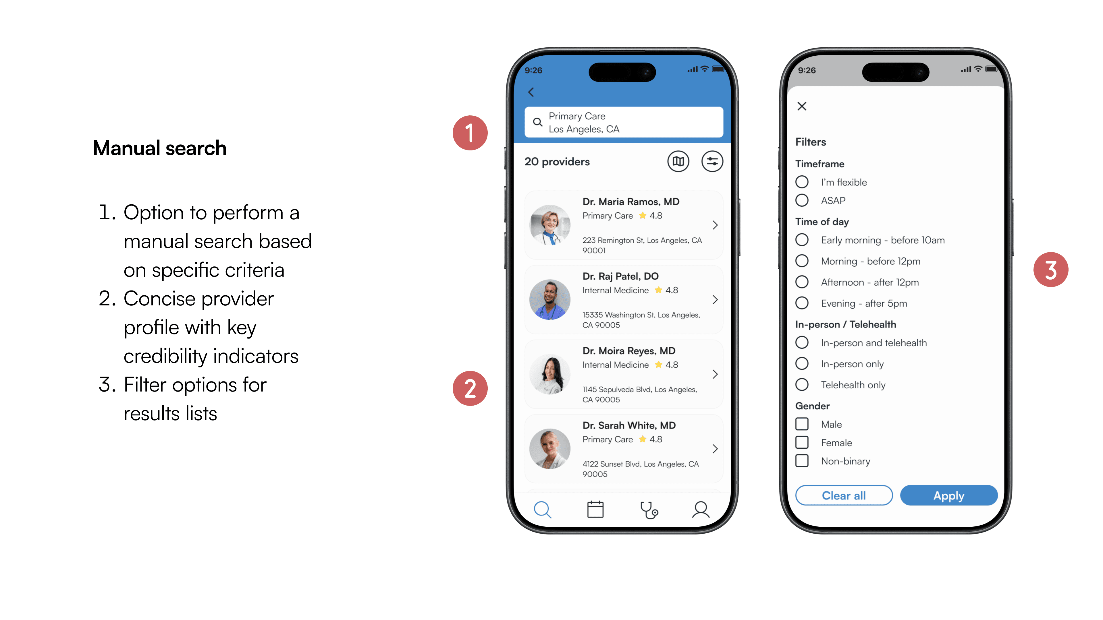
Final refinements addressed key testing feedback to create a polished, user-centered interface that balances guidance with efficiency, and ensuring an intuitive and engaging experience.