Dr. O, DPT
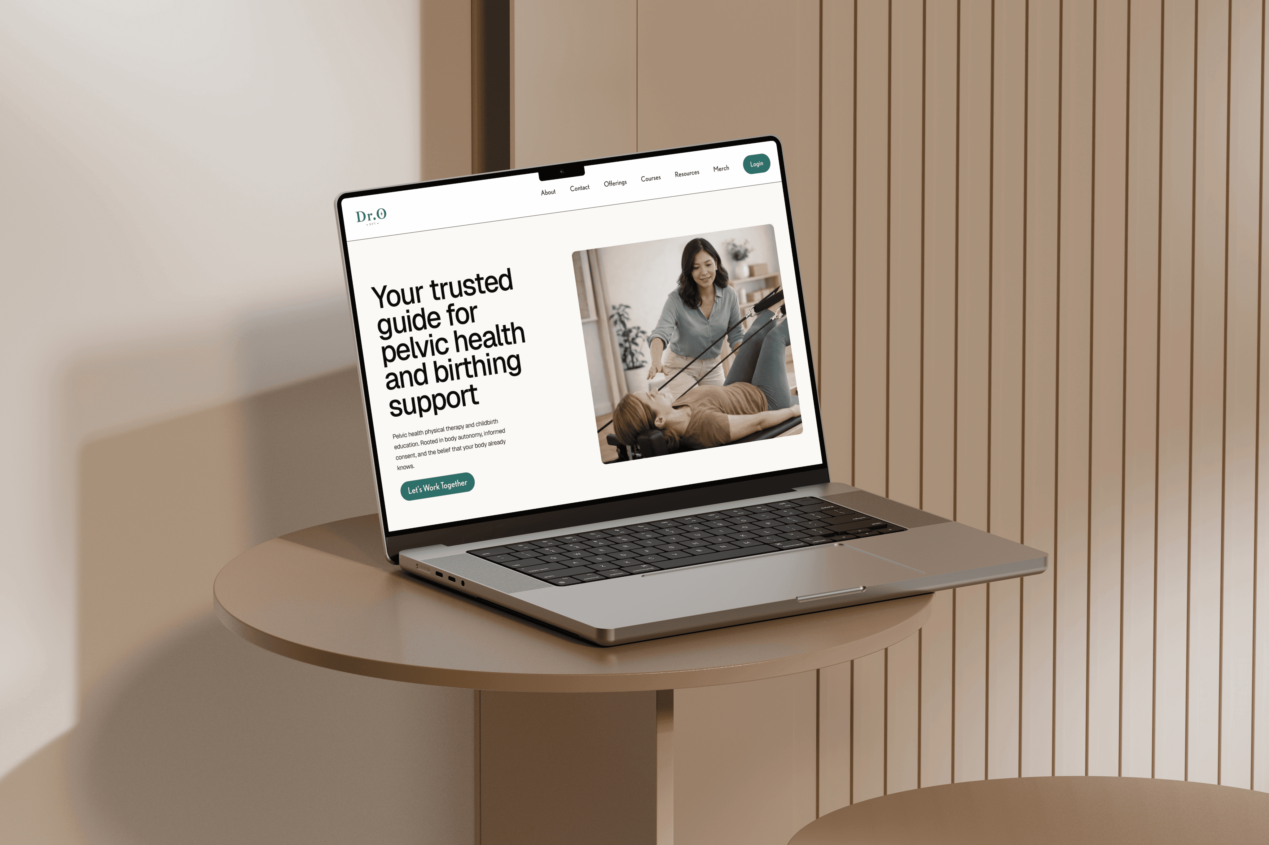
Designing a website for a pelvic health physical therapist and childbirth educator.
Role
UX/UI Designer
Industry
Health
Year
2025

The Process
Research
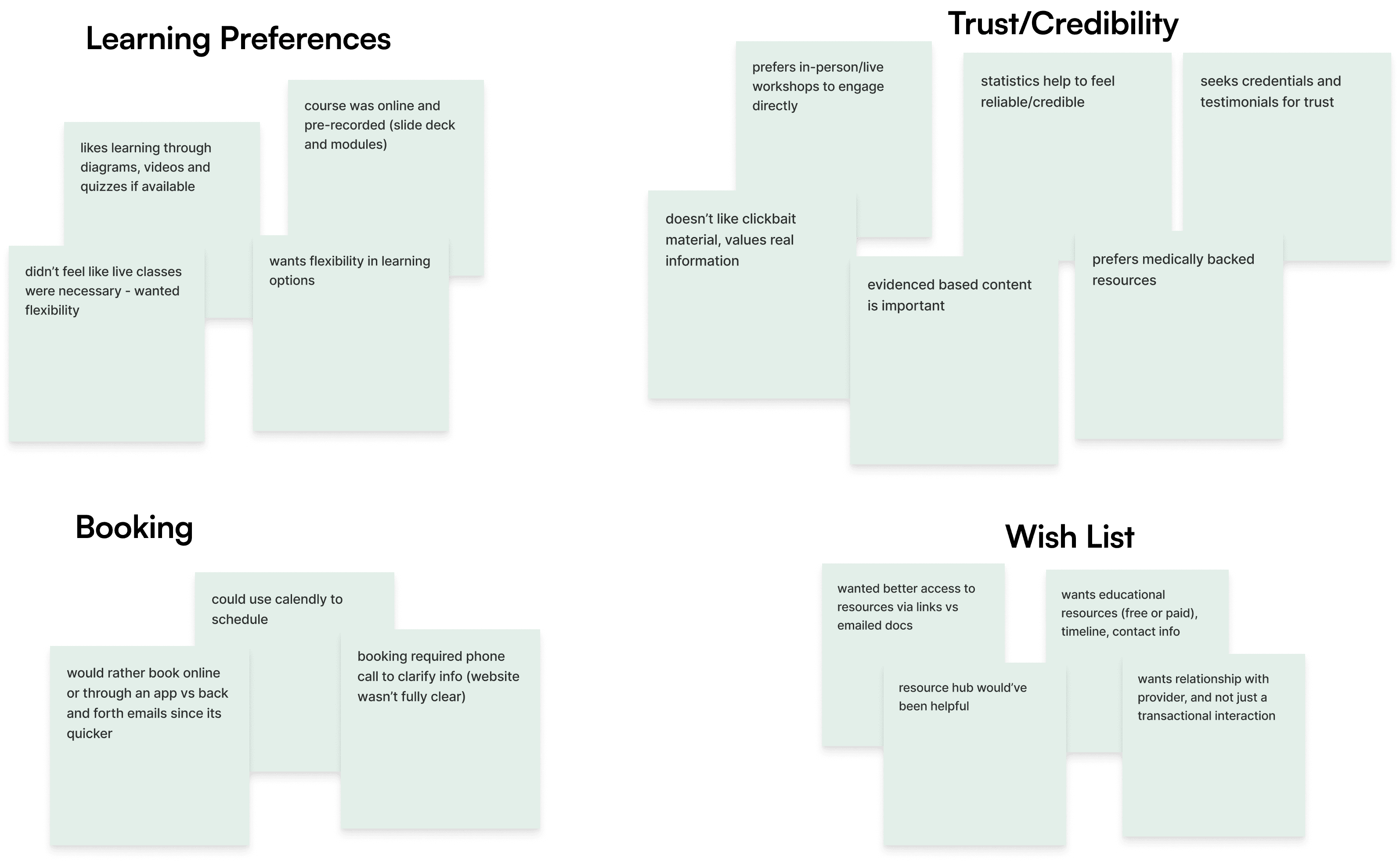
Research findings showed that users choose services they trust fast, want flexible learning options, and judge credibility instantly through clean design, clear booking, and human language.
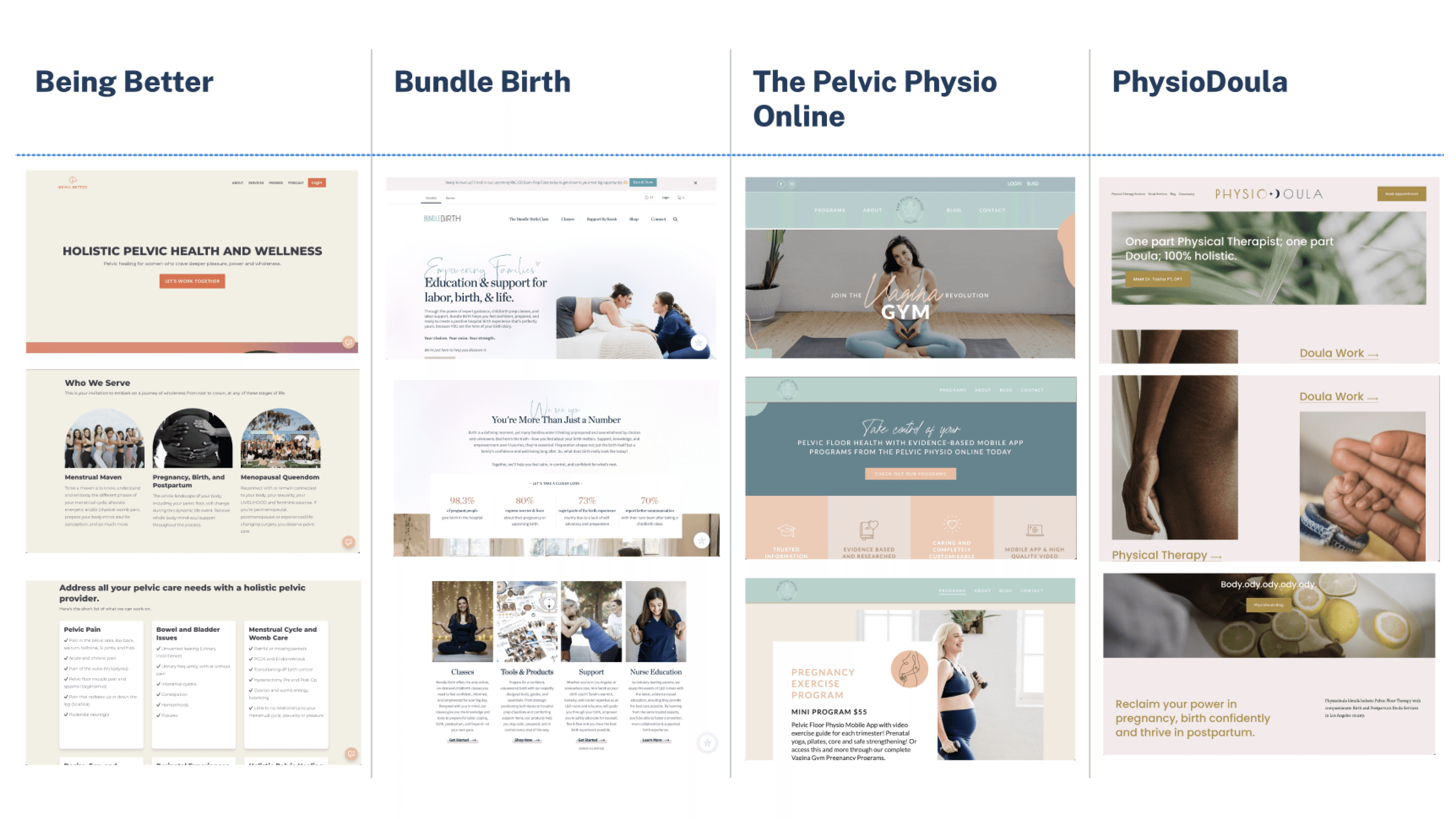
Initiated the project with performing a competitive analysis and conducting user research interviews with recent or expecting mothers. The goal of the research phase was to understand the target audience better, and learn how similar professionals portray their services online.
After conducting interviews, I created an affinity map to synthesize findings. Key insights and design opportunities emerged, guiding the transition into the define phase.
Competitive Analysis
User Interviews Affinity Map
Key Insights
Users weren't hesitant about online booking or digital content broadly, but more so about trusting a provider they couldn't easily verify or reach. Every desired feature (testimonials, credentials, call/email fallback, no account walls) traced back to wanting reassurance before committing.
Users prioritize easy booking, credibility, flexible learning, and intuitive design.

Problem Statements
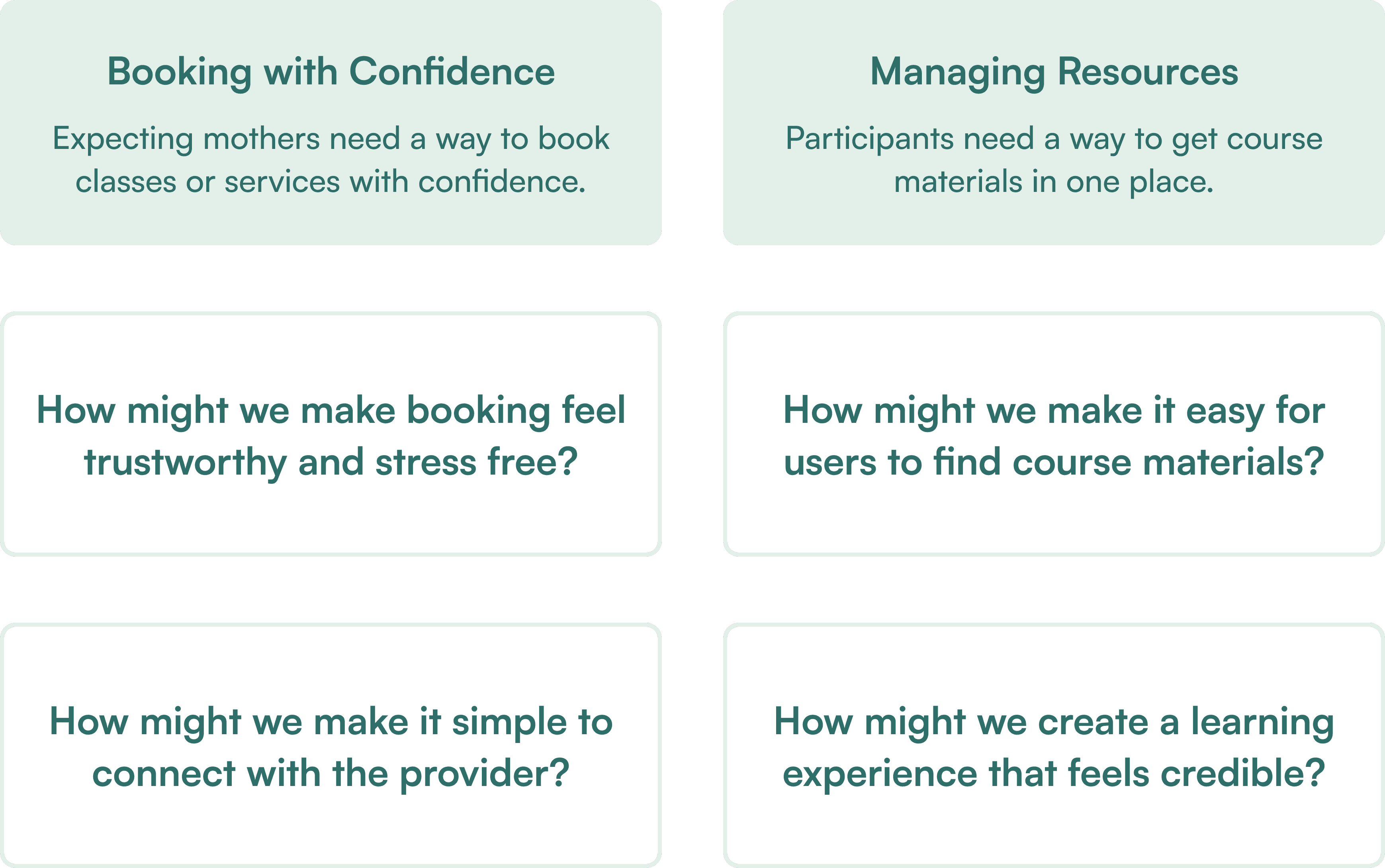
Users need confident booking experiences and organized course access.
Research revealed two pain points: booking uncertainty and course material overwhelm. I translated these into problem statements focusing on users' needs for confidence and organization, then reframed them as "How Might We" questions to guide ideation toward solutions that build trust and reduce stress.
Stakeholder Alignment
Balancing stakeholder goals, user needs, and project scope.
Before ideation, I aligned with Dr. O on must-haves: a modern site with service listings, booking functionality, resource downloads.
Aligned Project Goals:
Create a responsive website showcasing services.
Build an online learning platform for purchasing and booking courses.
Add a centralized 'Resources; hub for downloadable materials.
Wireframes
From initial concept to high-fidelity.
Low Fidelity
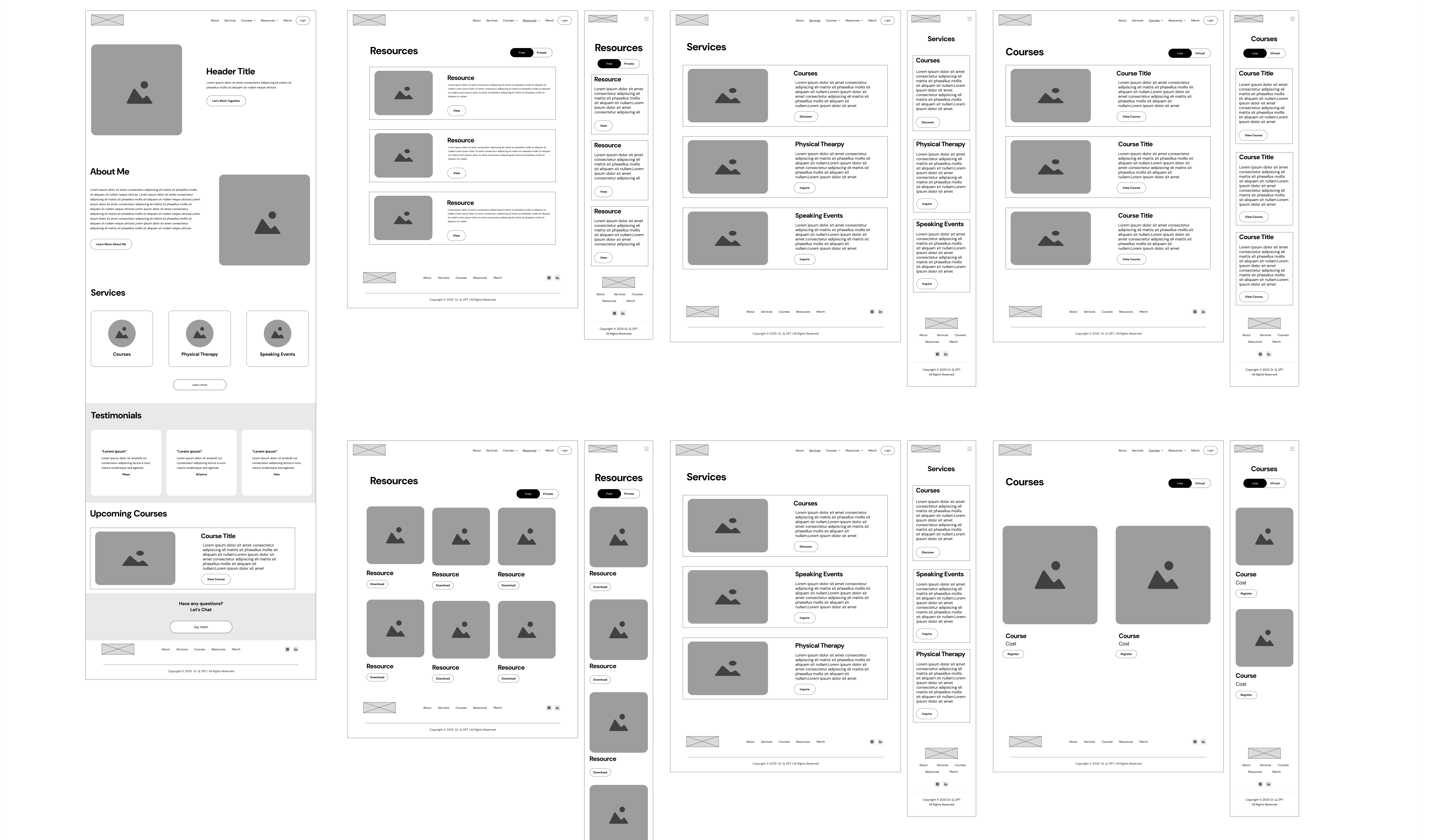
I started with low-fidelity wireframes to establish navigation structure and user flows, then ran usability testing to validate before moving into visual design. Moving into the high-fidelity designs, I utilized AI tools to help generate layout variations and test visual hierarchy decisions before finalizing.
High Fidelity
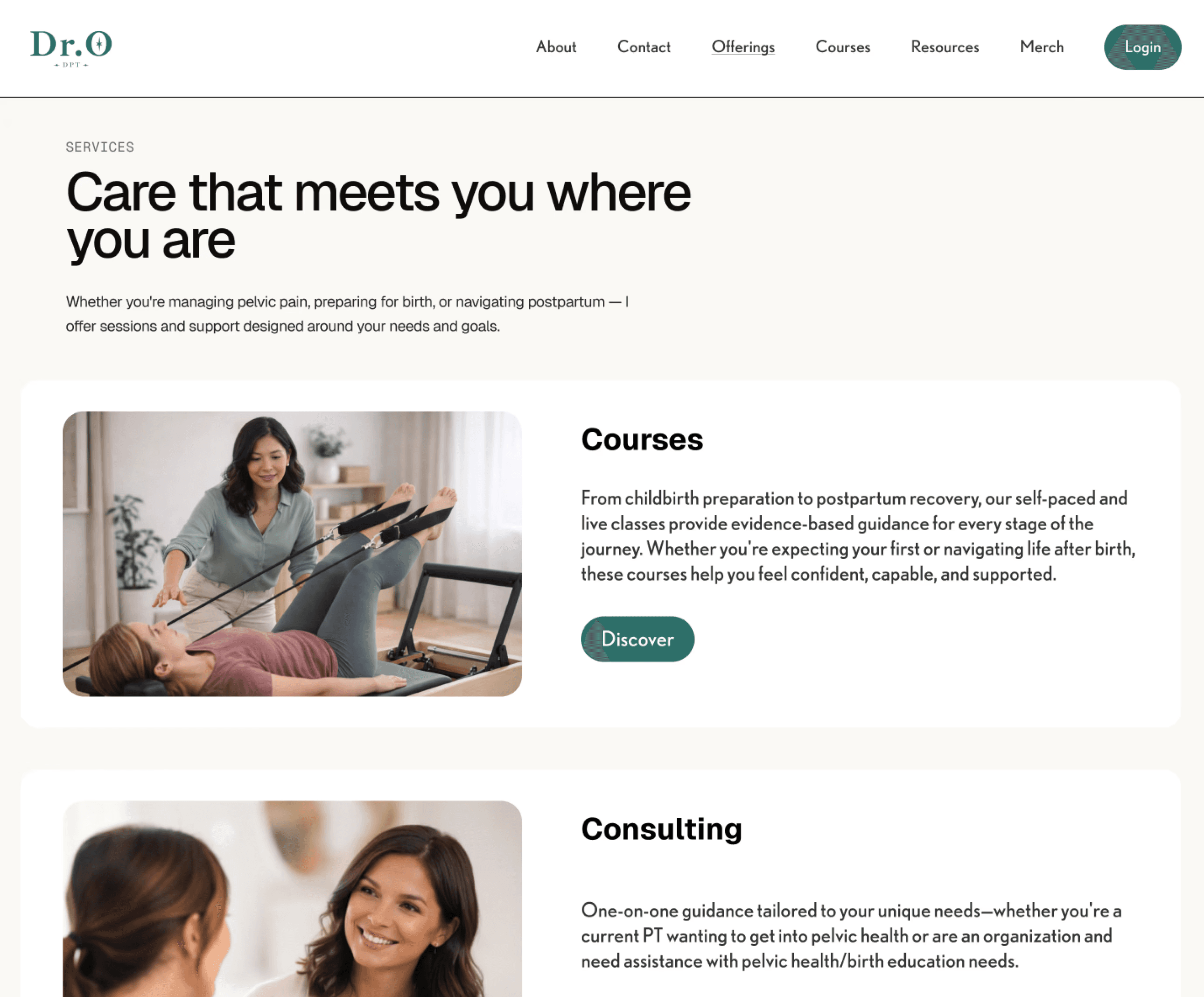
Discovering Services
Research showed visitors scanned for "is this for me?" before reading further. Services are organized by service type, so a visitor can self-identify immediately. Each offering leads with a plain-language description rather than clinical terminology, responding to a trust insight from research: approachable language lowered perceived barrier to reaching out.
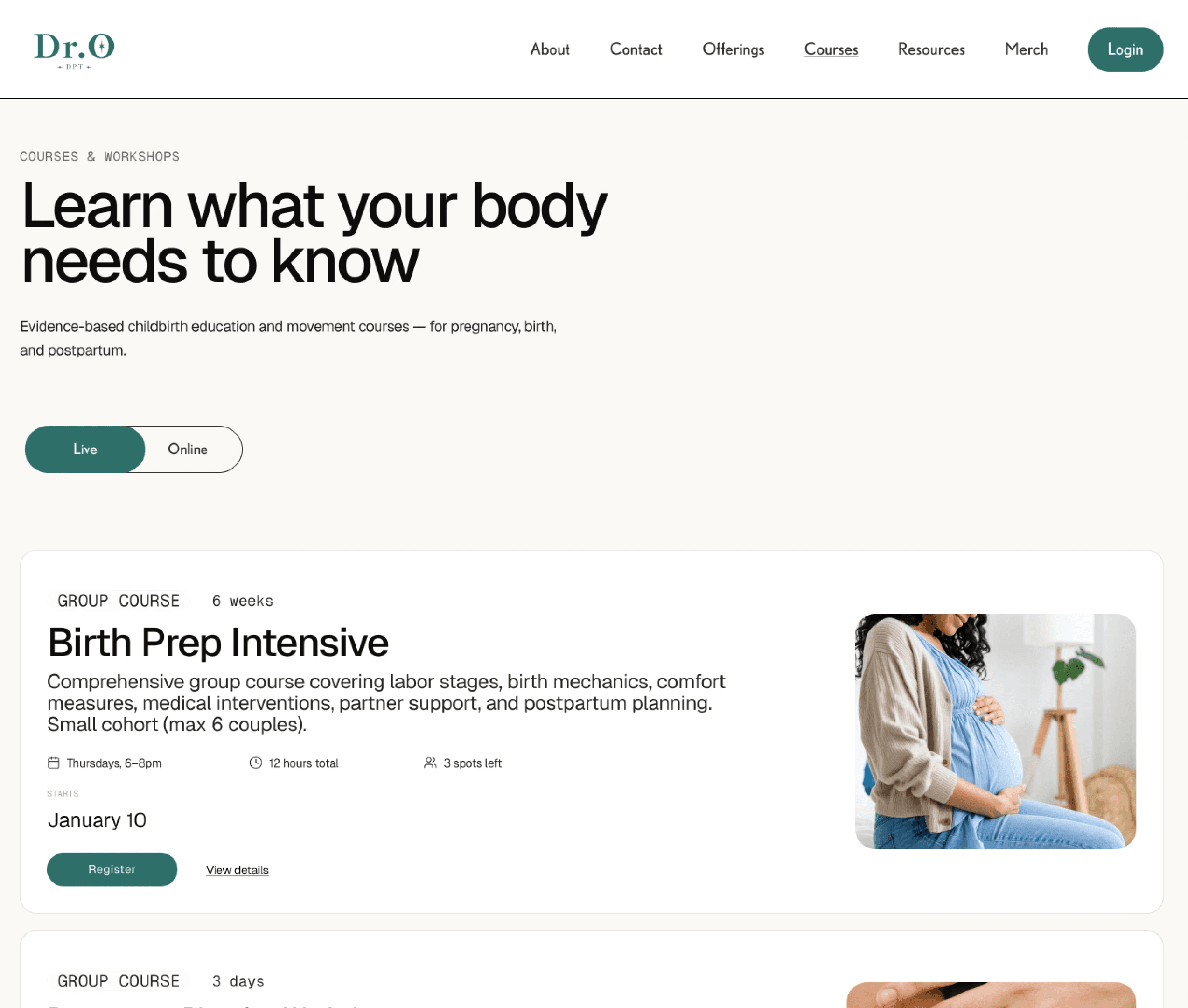
Browsing Courses
Booking was the clearest pain point in research: people wanted to book online but didn't fully trust an online-only flow without a way to reach a real person. The booking flow keeps self-serve scheduling as the primary path, but keeps contact persistently accessible via the navigation bar. With Dr. O planning to offer self-paced online courses in the future, a toggle between live and on-demand course formats was included, keeping the architecture scalable without overcomplicating the current view.
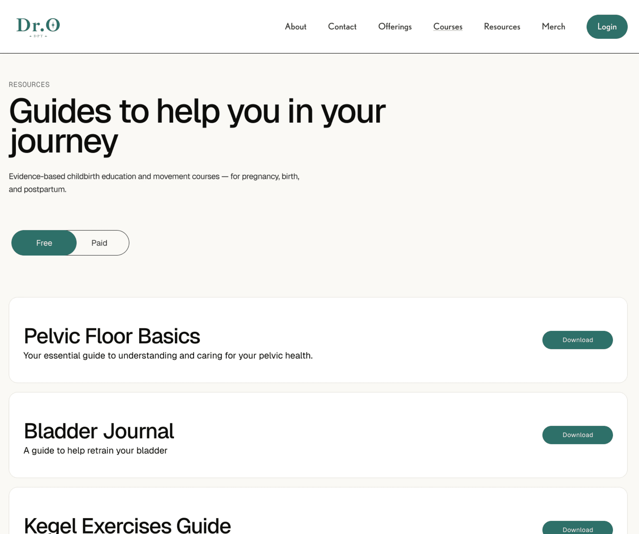
Resources Hub
Research flagged access friction as a recurring frustration. Users expected to find materials without navigating multiple steps or committing before understanding what was available. The hub separates free and paid resources into clearly labeled sections, so visitors can access what's immediately available and understand what requires purchase before committing. Pricing is surfaced up front rather than revealed at checkout.
Usability Testing and Prototyping
Usability testing on the high-fidelity prototype showed 100% task completion with no critical errors and users described the site as "simple" and "easy to navigate." Since the site hadn't yet launched, I also used Claude Design to generate a more realistic prototype as a way to pressure-test my own choices and for sharing with the client.
Next Steps
Design Implementation
Development and launch.
The next phase involves future collaboration with Dr. O and a developer and oversee the implementation of the designs into a fully functional website. This includes ensuring design fidelity, addressing technical constraints, and maintaining the user experience throughout development.


