COT
Designing a mobile app to simplify session booking, enhance engagement, and increase user retention for online tutoring.
Role
UX/UI Designer
Industry
Education
Year
2025

Overview
Background
COT connects students with qualified tutors through a web-based platform. With students increasingly managing their lives on mobile devices, the company needed a mobile solution to remain competitive and meet evolving user expectations.
The founder put it plainly in our first meeting:
"There are some apps that we use where we never visit the website, we only use the app. Like Uber. That's what we need — a mobile app for key actions, not just information."
Problem
Students lack a simple way to manage their tutoring experience when they're away from their computers. Booking a session, checking a schedule, or receiving a timely reminder about an upcoming lesson all required going back to a browser. In a world where every other service a student uses lives in their pocket, this creates friction in the user experience and leads to a competitive disadvantage.
Solution
A native mobile app that enables students to seamlessly book sessions, track their learning progress, and stay engaged between lessons. A solution built for the mobile-first experience students expect.

The Process
User Research
Interviews revealed that trust and transparency were the deciding factors.
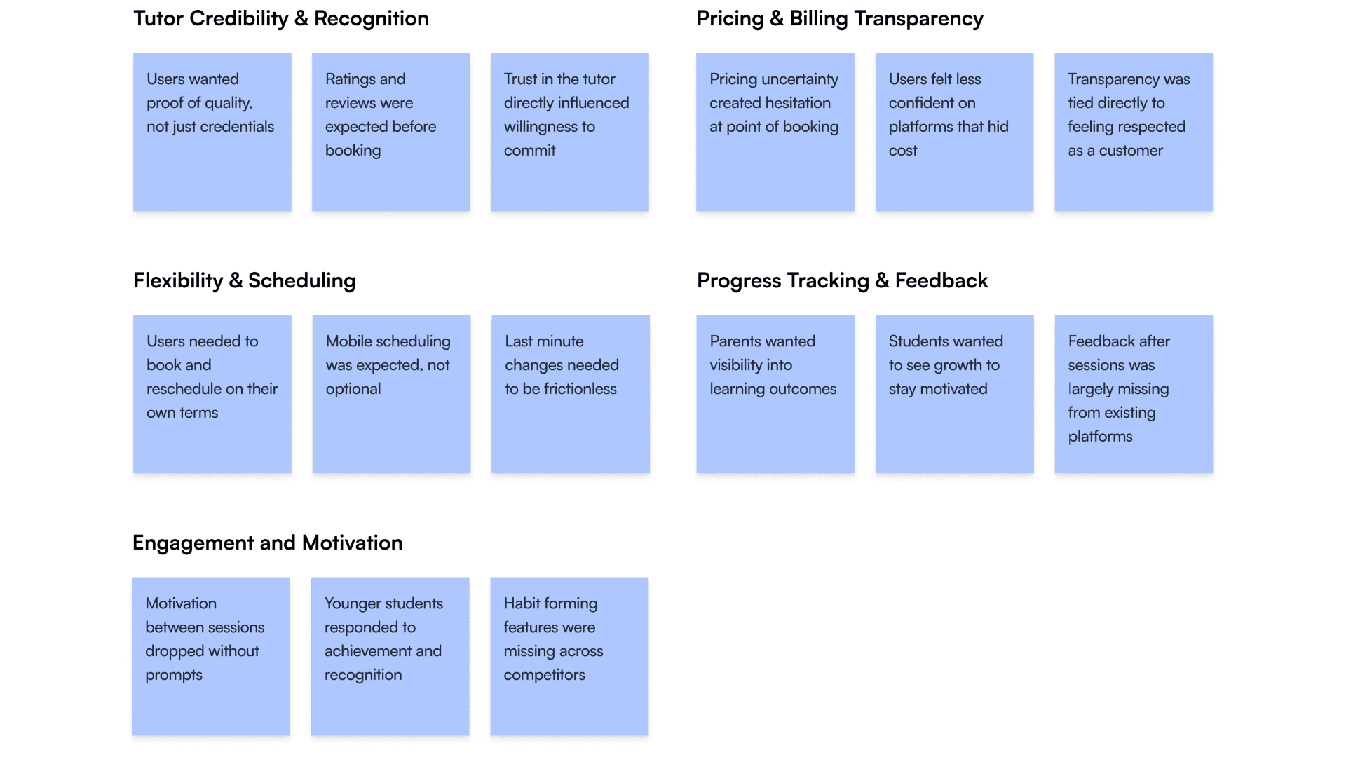
We interviewed students, parents of younger learners, and adult learners to understand where existing tutoring platforms were falling short. Five themes emerged consistently: tutor credibility, pricing transparency, flexible scheduling, progress visibility, and ongoing engagement.
Competitive Analysis
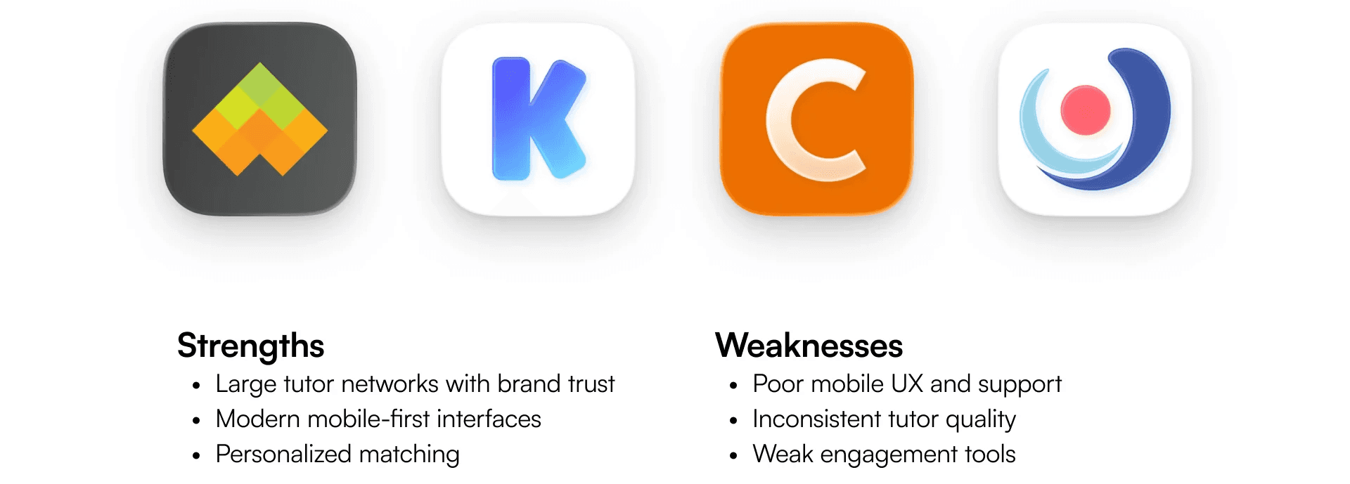
Existing platforms excel at matching and scale but struggle with mobile usability, and keeping students engaged.
We examined existing tutoring platforms to understand what was working and where the gaps were.
The market is crowded but fragmented. Legacy platforms like Wyzan carry strong reputations but feel corporate and outdated on mobile. Newer entrants like Kadama have fresh, youth-oriented design, but lack the educational credibility that parents and serious students need.
The strategic opportunity was specific: a platform that combines the trust signals and credibility of established players with the mobile-native design sensibility of newer ones. No competitor was doing both well. That gap was the space COT could own.
This insight directly shaped our design priorities where credibility signals needed to be visible and immediate, and the experience needed to feel effortless and modern on mobile from the very first interaction.
Problem Statement
Existing platforms make users work too hard for confidence
Students, parents, and adult learners need a way to find the right tutor and manage their experience with confidence because existing platforms make them work too hard for information that should be immediate.
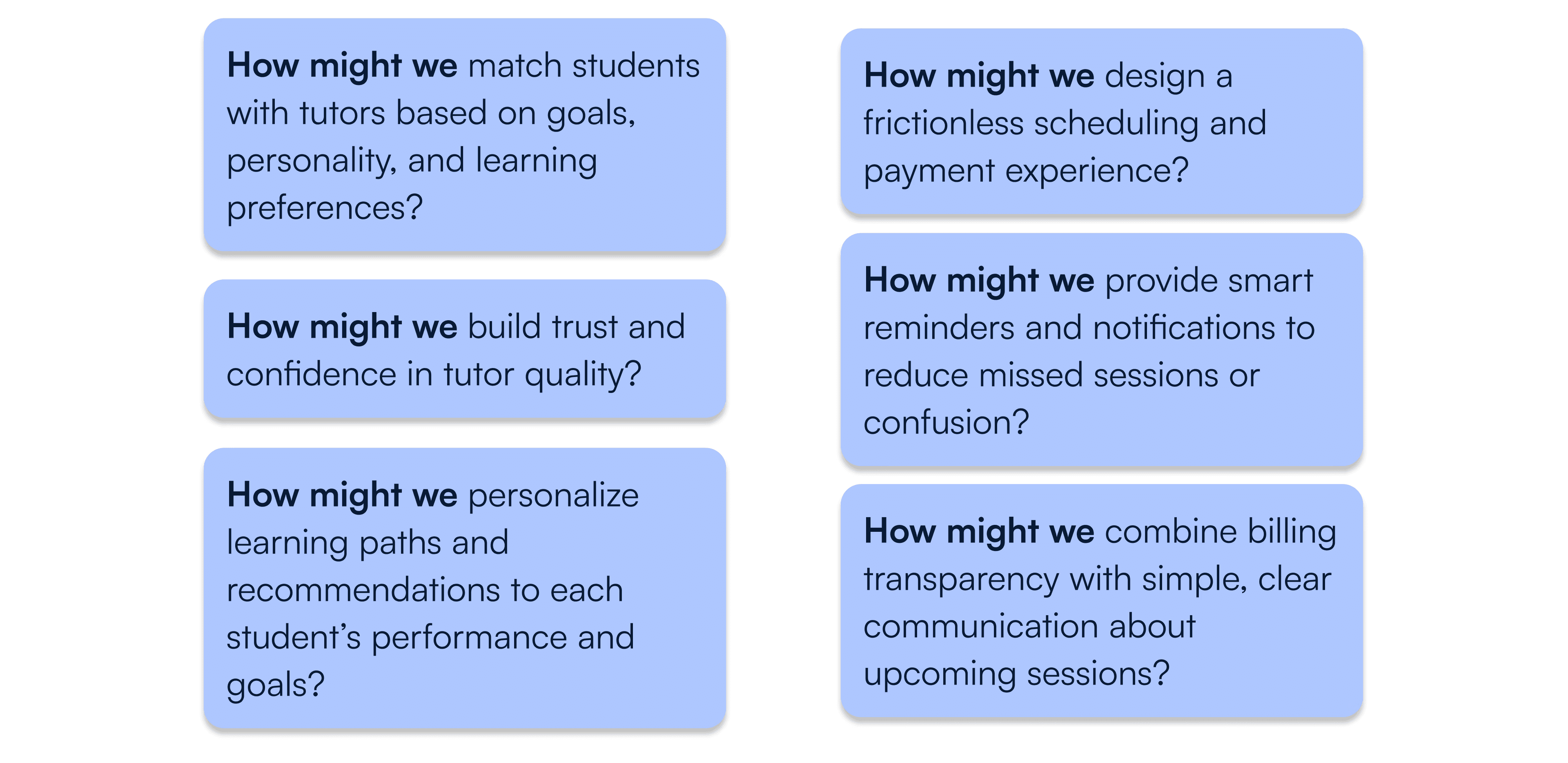
How Might We Questions
These questions guided our design thinking and kept user needs central throughout ideation.
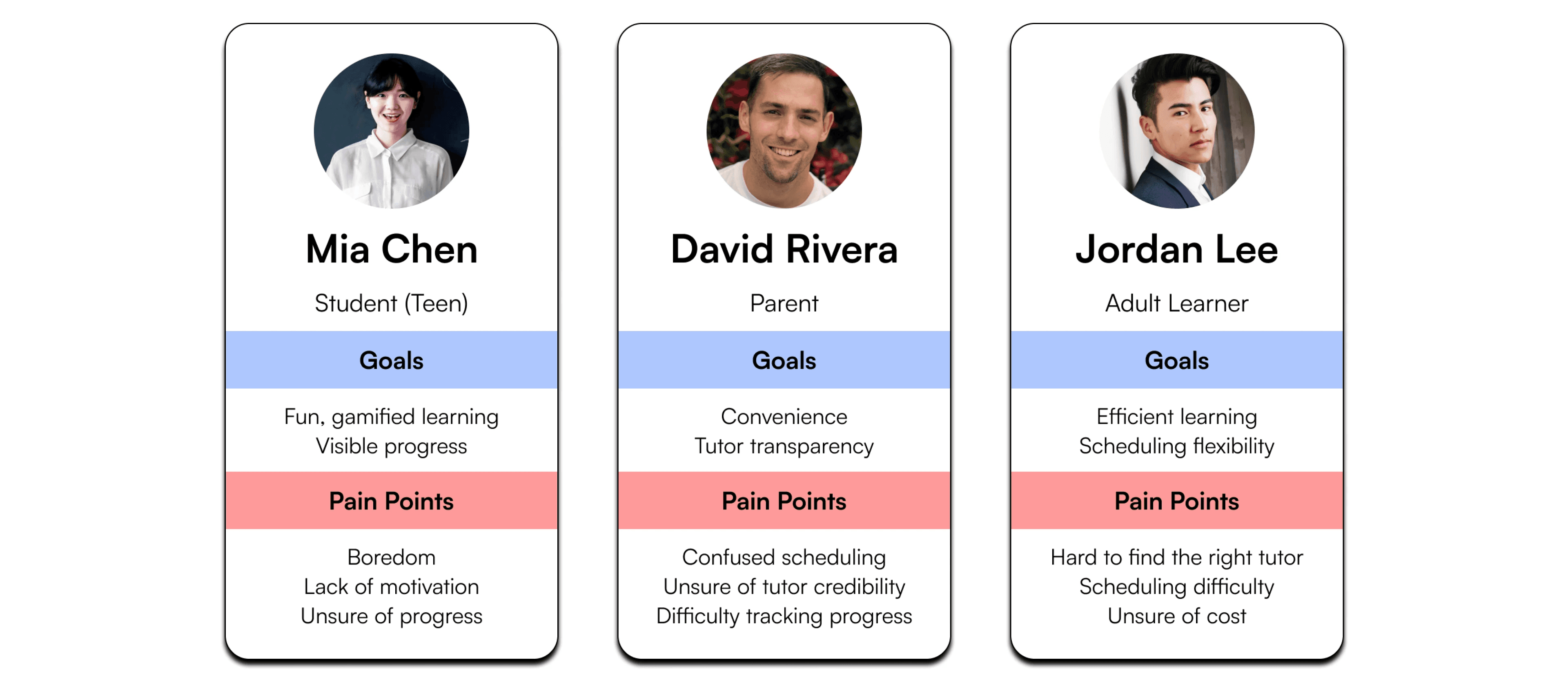
Personas
Meet our users: parents managing education for their children, students seeking motivation, and adults pursuing personal development.
We developed personas from user research to represent our primary audiences and keep their needs central throughout the design process.
Feature List
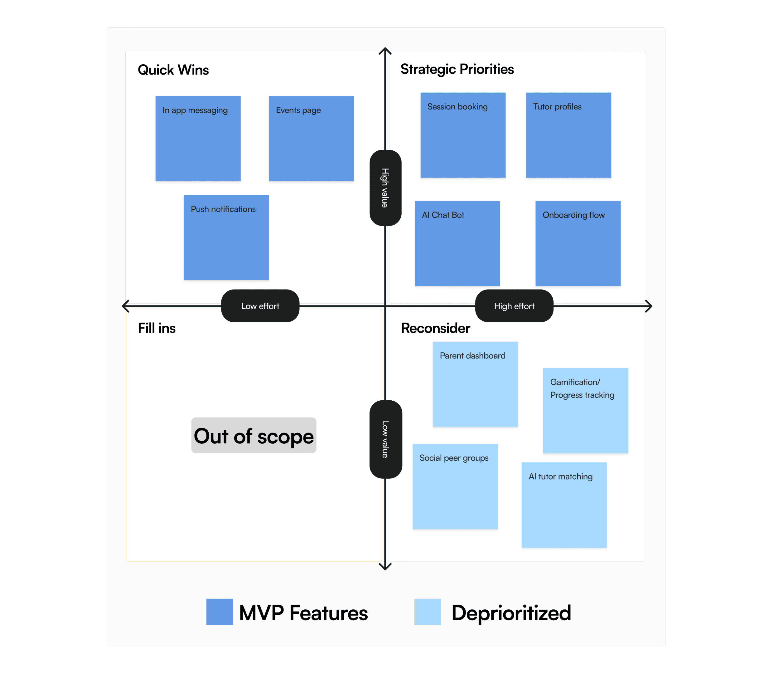
Based on user research insights and founder priorities, we identified core features for the MVP that address the most critical user needs while establishing a competitive mobile-first foundation.
Features the research supported, but that were deprioritized for the MVP included gamification elements, a parent dashboard, AI-powered tutor matching, and a social or peer learning feature. Some of these were cut for timeline reasons, while others were shaped by the founder's priorities about what the business was ready to support.
Low Fidelity Designs
Getting ideas out quickly with AI-assisted exploration
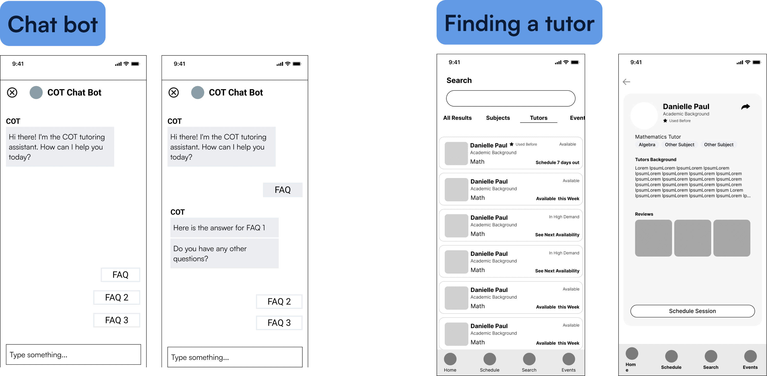
Given the time constraints for this project, we moved quickly from research synthesis into ideation. As part of this project we also took the opportunity to familiarize ourselves with emerging AI tools, such as Claude and Stitch, to generate early layout directions and interaction patterns rather than starting from a blank screen. This compressed the time between insight and first draft, giving us more runway for refinement and testing.
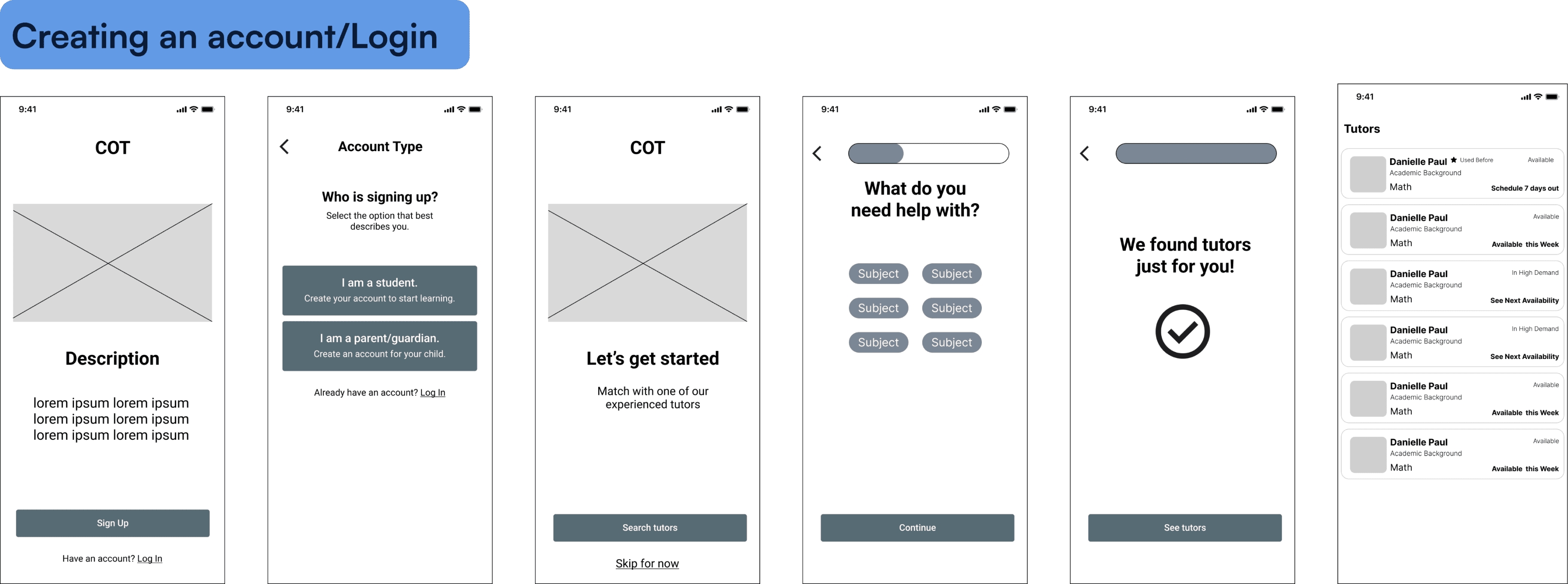
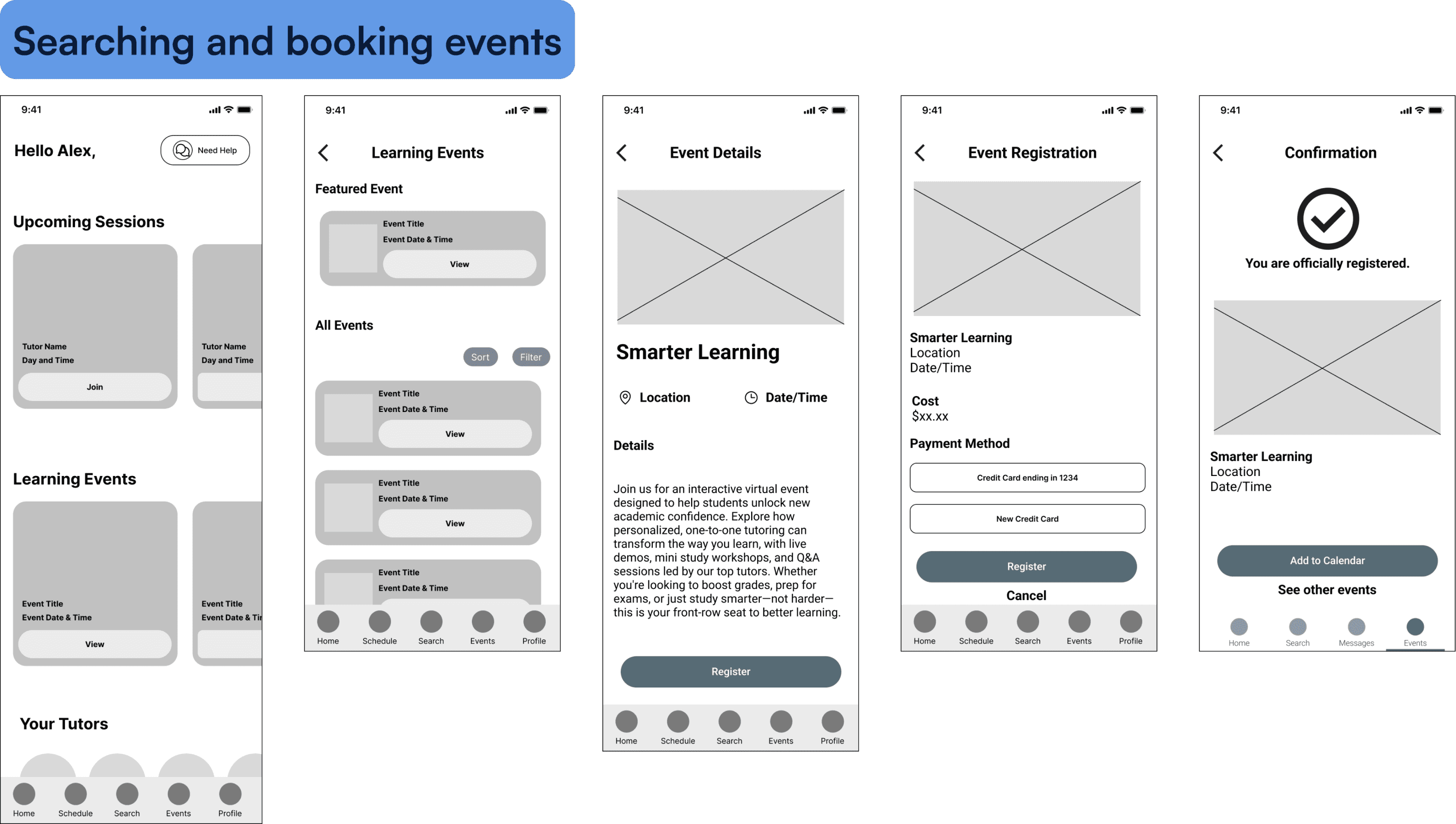
Working collaboratively with my design partner, I led the development of the onboarding flow, home screen, tutor profile, events page, and chat interface. We divided flows to move in parallel while syncing regularly to maintain consistency across the product.
Usability Testing
Strong initial designs in which most flows worked, but revealed the booking flow needed work.
We conducted usability testing through five task flows: onboarding and tutor profile discovery, search for a tutor and schedule a session, purchase additional tutoring credits, use chatbot to find tutor and booking info, and RSVP for a learning event. The results validated most of our design decisions with high success rates and no users performing critical errors, but also surfaced that the booking flow needed attention.
With those insights in hand we moved into high fidelity designs, elevating the wireframes with full branding and UI refinement. The flows that tested well were refined and polished, while the scheduling flow was iterated on.
High Fidelity Designs
After we tested our low and mid-fidelity wireframes to validate core interactions, we then elevated the designs to high-fidelity with full branding and UI refinement.
Users navigated most features successfully, but scheduling sessions proved most challenging. This insight drove iterations to streamline the booking and scheduling experience.
Onboarding Flow

The onboarding flow was designed to get students to their first tutor recommendation as quickly as possible. Every step collects only what's needed to personalize the experience, so the first screen a student sees after signing up feels relevant to them specifically.
Home Screen
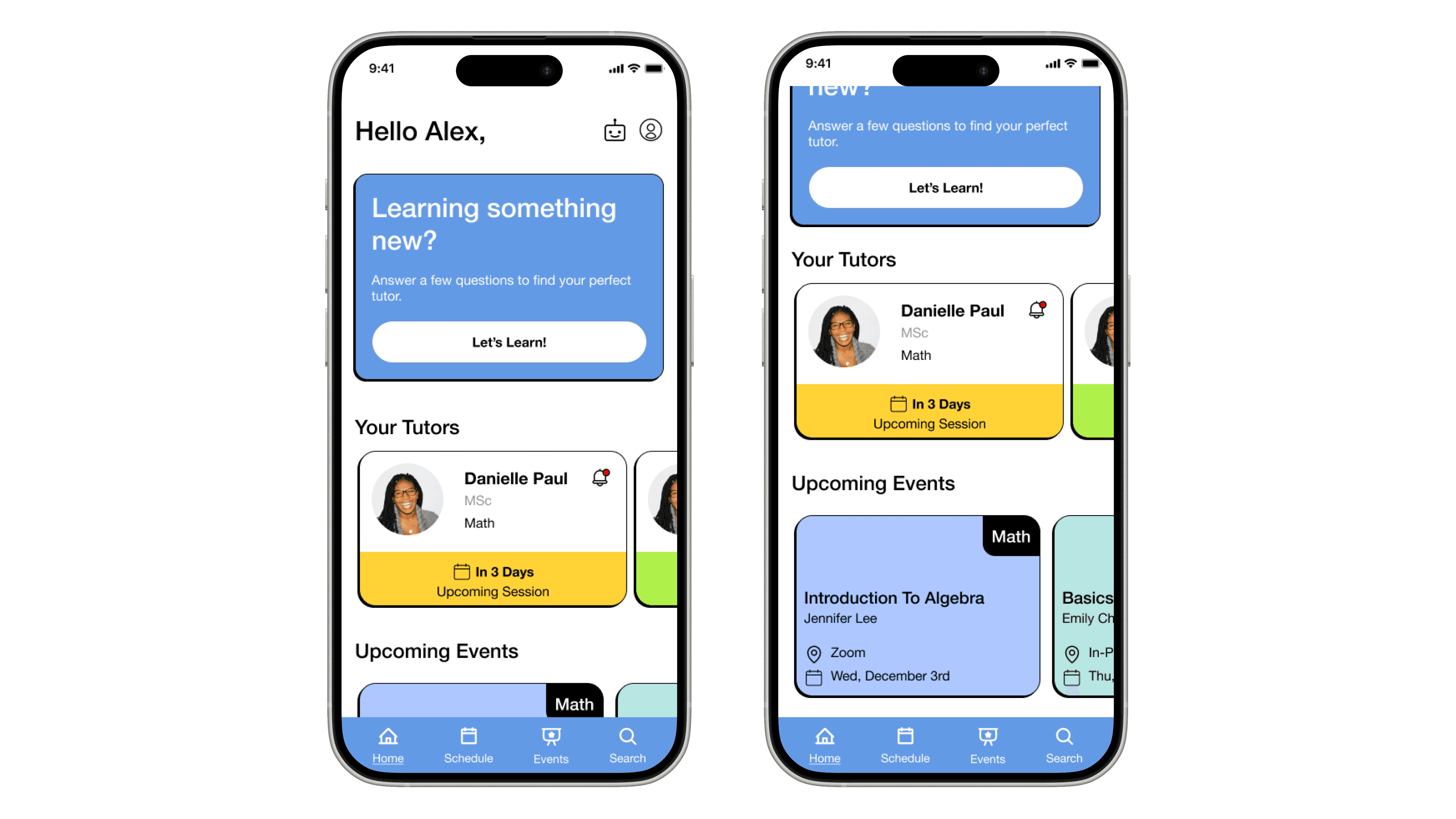
The home screen was designed around the idea that student should be able to take any key action from here without going back to the website. They can see their schedule, upcoming events, search for tutors, access their profile, and utilize the AI chatbot for FAQs and assistance.
Tutor Search and Profile
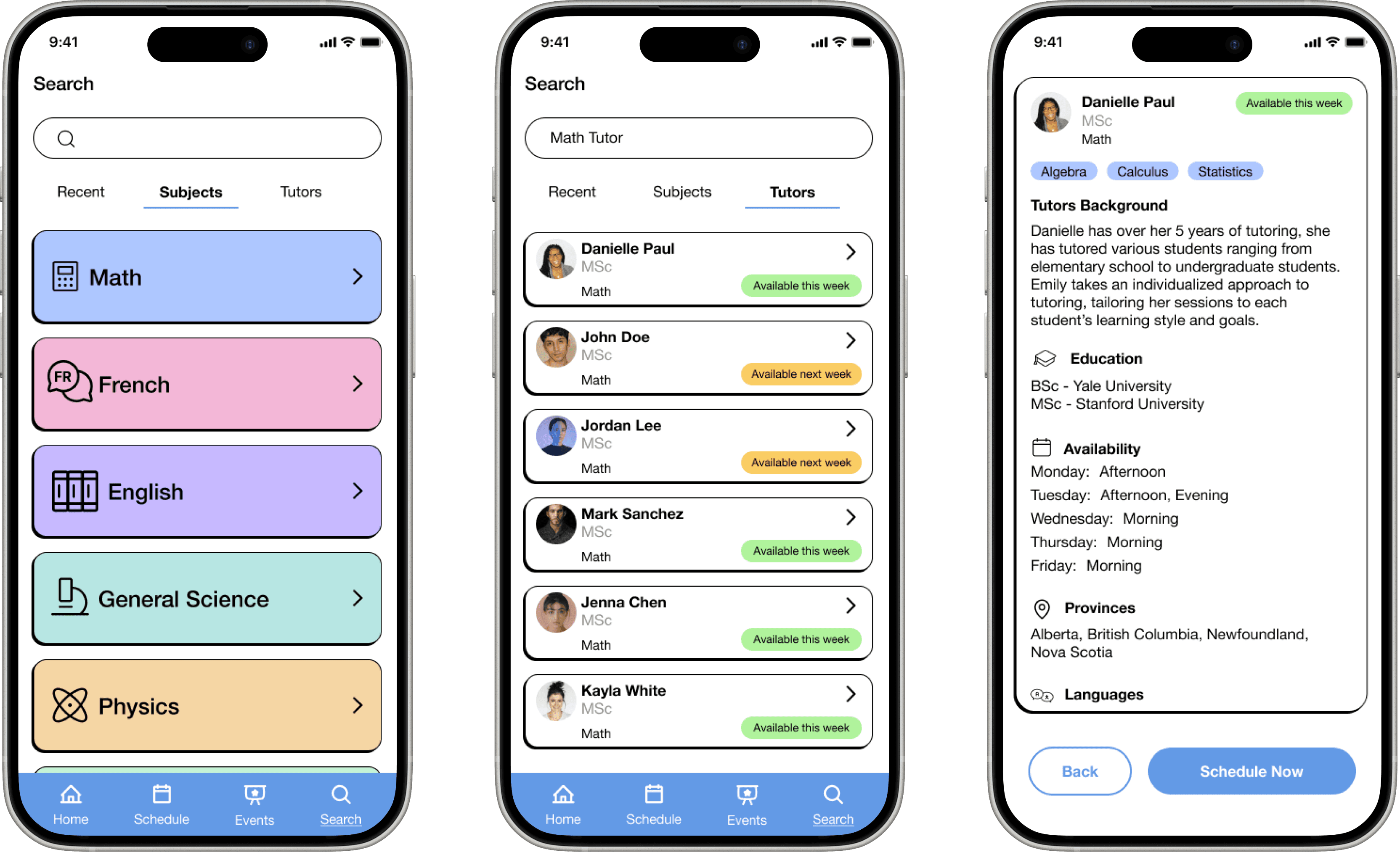
Tutor discovery was one of the highest priority flows from research. The search page was designed to allow users to search by subject or tutor name. The profile card surfaces the information users told us they needed to feel confident including, subject expertise and availability; while also limiting visibility to cost and reviews due to company policies.
Scheduling
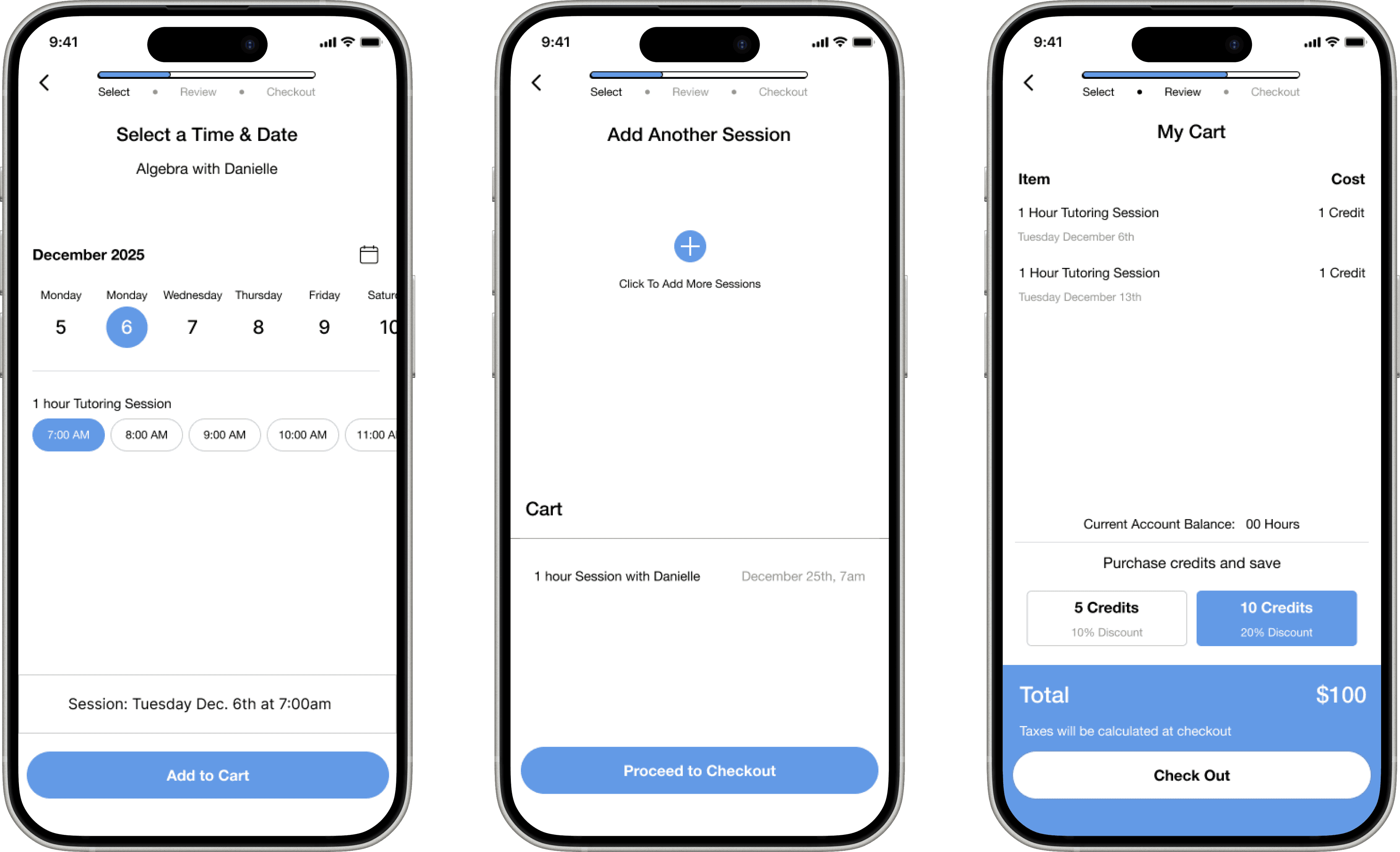
The scheduling flow was our most challenged area, with the lowest success rate. The high fidelity version addressed some of the friction identified, clearer step progression and a more intuitive date and time selection.
Chat Bot
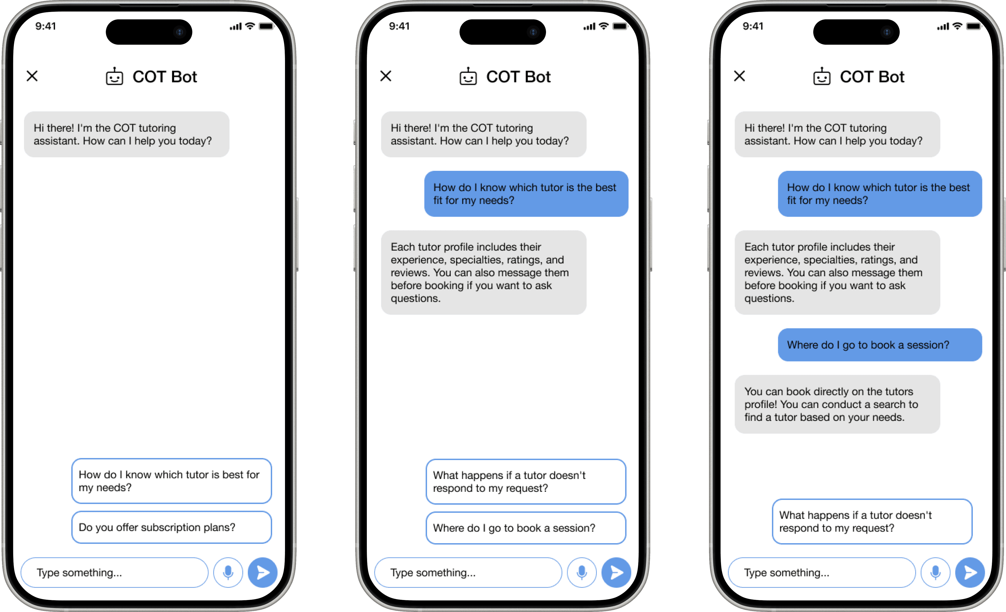
The chatbot interface was designed to address FAQs in a conversational way, guiding students toward the right tutor and helping them understand how to book without navigating away.
Events
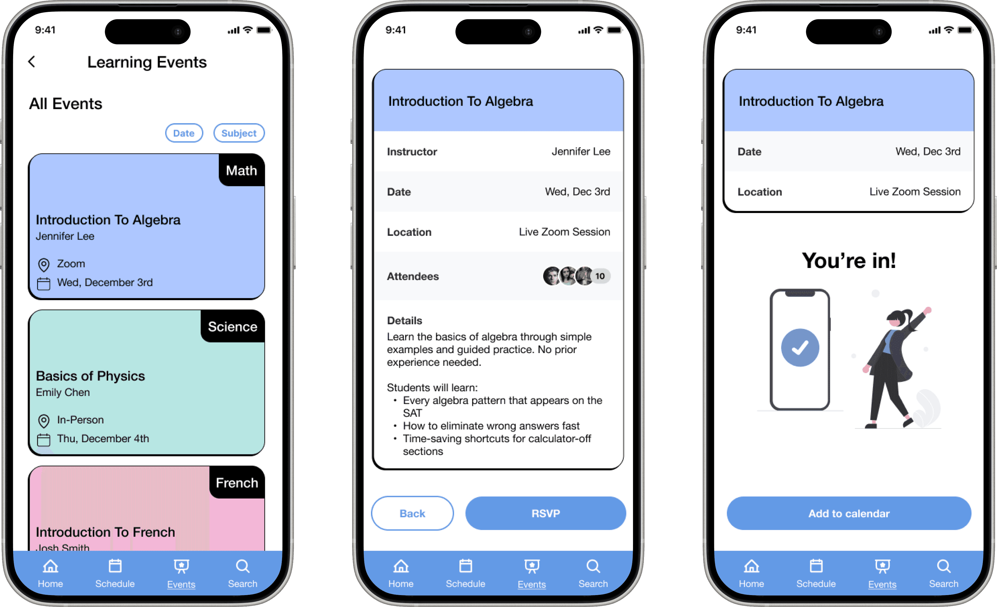
The events page was the highest performing flow in testing. Students can easily discover and RSVP for live learning events directly from the app.